
8 Motion Graphics Text Animation Examples
 September 21, 202630 Minutes
Meta description: Motion graphics text animation turns podcast clips into branded reels, lower-thirds, and promos. Compare 8 formats and choose the right one fast.
URL slug: /motion-graphics-text-animation-examples
Primary keyword: motion graphics text animation
Secondary keywords: kinetic typography, animated captions, podcast motion graphics
Make Every Spoken Moment Visible
Most advice about motion graphics text animation gets one thing wrong. It treats animated text like surface polish, when job is communication. If your podcast has strong ideas, sharp quotes, or memorable guest moments, text animation turns those spoken moments into visual assets people can read, feel, and share.
That matters because repurposing long-form audio often falls apart at the caption stage. Every clip starts to look the same. The pacing feels flat. Key lines get buried inside generic subtitles that do little for brand recall or conversion. The fix isn't “more motion.” It's choosing the right text behavior for the message.
The eight formats below sort motion graphics text animation by the communication job each one performs, from attention and comprehension to mood, brand signaling, and conversion. You'll see how each style works for vertical social clips, lower-thirds, teaser trailers, and branded podcast promos. If you want the whole workflow handled in one place, Flexwork Studios can connect recording, editing, motion graphics, and Content Day deliverables into a single production system. If you're also improving voice clarity in tricky footage, this guide on AI dubbing for obstructed faces is a useful companion.
DIY creators usually hit the same wall. Visual quality shifts from post to post, mobile readability gets ignored, and every reel becomes a custom build that eats time. A branded system solves that. It gives you repeatable animation logic, cleaner lower-thirds, faster approvals, and a better-looking feed without reinventing every asset.
1. Kinetic Typography
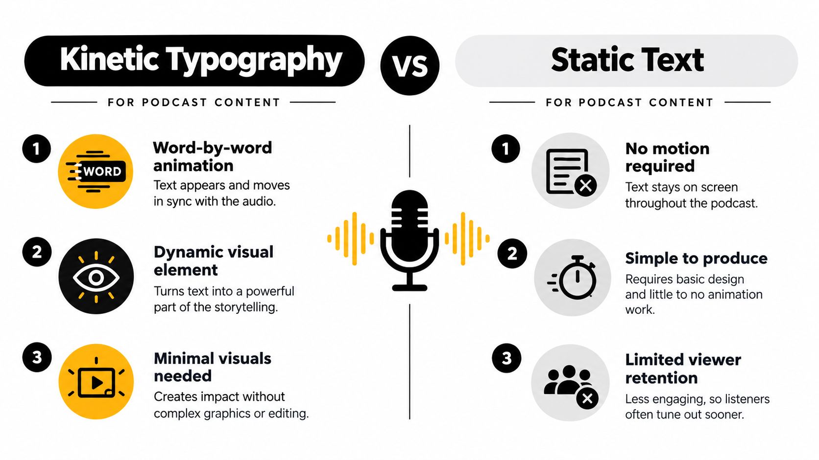
Kinetic typography is the format to use when the words themselves need to carry the scene. Instead of parking captions at the bottom and hoping the quote lands, you animate the line so the pacing follows the speaker's delivery. A sharp phrase can punch in. A pause can hold. A key word can expand just enough to become memorable.
Its roots are older than most creators realize. Scholars widely trace the clearest precursor to Georges Méliès's animated letter-forms from 1899, then to Saul Bass's 1959 title sequence for Alfred Hitchcock's North by Northwest, which is identified as the first feature film to extensively use kinetic typography. Bass repeated the approach in Psycho in 1960, helping establish animated text as a mainstream title technique in that era, as summarized in this kinetic typography history.
Where It Works Best
For podcasters, kinetic typography shines in intros, hot-take clips, and episode teasers. A business host can animate three punchy takeaways from a guest interview for LinkedIn. A culture show can build a fast vertical trailer around a single line that deserves emphasis. Joe Rogan-style quote clips, TED-Ed-style concept breakdowns, and YouTube Shorts all use the same principle. Let the text perform, not just document.
Use it when attention is the primary goal, but keep the reading experience clean. Accessibility guidance recommends short, entry-focused transitions with a readable resting state, and suggests quick fade-ins around 0.2 to 0.3 seconds while avoiding blur-based reveals, marquees, and parallax because they raise legibility risk, according to this accessibility guidance on motion type legibility.
Practical rule: Animate the entrance, then let the viewer read.
A polished workflow helps. Build one kinetic template for 15-second reels, another for 30-second promos, and a longer version for full-episode captioned clips. Flexwork's guide to creating motion graphics for branded video content is a smart next step if you want a repeatable system. For a more experimental take on spoken language visualization, try exploring spoken word stylography.
2. Typeface Morphing and Shape-Shifting
Typeface morphing gives text a narrative role. One word becomes another. A guest name transforms into their field. A problem statement reshapes into the solution. That movement feels intentional, which is exactly why it works so well for brand-led podcasting.
This is one of the most elegant choices when your show lives in transformation. Think coaching, founders, wellness, reinvention, career strategy, or any format where the conversation moves from uncertainty to clarity. A title like “Burnout” can morph into “Boundaries.” A guest's name can resolve into “Investor,” “Author,” or “Therapist” right before the interview begins.
Use It for Premium Brand Signaling
Morphing has a more editorial feel than straightforward caption animation. It tells viewers that the show has a point of view. That makes it strong for episode opens, sponsor bumpers, title cards, and short campaign trailers that need to feel polished without going fully cinematic.
Keep the move decisive. The most effective morphs happen at turning points in the message, not on every line. If you overuse the effect, the transformation stops feeling meaningful and starts feeling ornamental.
A few production calls keep it polished:
- Choose compatible fonts: Sans-serif faces with similar structure usually morph more cleanly than dramatic mismatches.
- Reserve it for message pivots: Use it when the meaning changes, not just because a transition is available.
- Pair it with simple backgrounds: Color shifts and geometric motion support the effect. Busy footage competes with it.
This format is ideal when your communication job is brand signaling plus narrative clarity. It's not the fastest style for high-volume posting, but it creates stronger identity than plain animated captions.
3. Staggered Entrance and Exit Animations
Staggered text is the workhorse format for comprehension. If your audience needs to follow a layered idea, a quote with multiple beats, or a quick teaching sequence, line-by-line or word-by-word entrances guide the eye in the right order.
This is the format I'd recommend first for educational podcast clips, guest quote videos, and summary reels. A host says three points. You reveal point one, then point two, then the closer. The result feels paced rather than dumped onto the screen. That's useful in vertical video, where viewers decide fast whether they'll keep reading.
Best for Readability in Social Clips
Staggering also protects mobile readability because it reduces text density. Instead of covering the screen with a full paragraph, you deliver small pieces that stay legible over footage. That's a better match for Reels, Shorts, and TikTok-style consumption where thumb-stopping depends on instant clarity.
For lower-thirds and repeatable social packaging, consistency matters more than drama. Use one entrance family, one exit family, one spacing system, and keep the timing tied to speech cadence. If your team needs a clean execution path, Flexwork's podcast motion graphics services fit this style well for branded clips and on-screen text packages.
Use staggered animation to control reading order, not to show off software.
When text appears over moving footage, keep contrast and control in check. Independent accessibility guidance says small text over motion should maintain at least a 4.5:1 contrast ratio, while large or bold text should maintain at least 3:1, and essential animation should be avoidable or pausable. The same checklist warns against relying on animation itself to make text understandable, as outlined in Deque University's animation and motion checklist.
This is the right format when your clip needs to teach, summarize, or clarify. It scales well, templates well, and repurposes well.
4. 3D Text Rotation and Perspective Transformation
3D text earns its place when you want a moment to feel like an event. A show open. A season launch. A guest announcement. A title reveal that needs cinematic energy. Used sparingly, it gives a podcast brand more dimension than flat text ever will.
This is not your all-purpose caption system. It's your hero asset style. A show title can rotate into frame for a YouTube opener. An episode number can flip forward for a series drop. A sponsor title can turn in perspective for a premium pre-roll. Those uses feel intentional because the text marks a big beat.
Save It for Hero Moments
The technical side matters here more than in simpler text motion. Motion-graphics training tied to Premiere Pro notes that text or image movement should happen in whole numbers of pixels per frame to avoid blur or shimmer. The same body of training material also points to keyframe-based easing as the mechanism that makes animation feel polished rather than mechanical, with examples that use influence values such as 100% and 50%, or 80% and 60%, summarized in this motion-design training reference.
That's why 3D text often looks expensive when it's done well, and cheap when it isn't. Rotation has to preserve legibility. Lighting and shadow need restraint. The easing can't feel rigid.
A few practical choices keep it premium:
- Use moderate angles: If the letters disappear during the move, the effect has already failed.
- Slow the timing down: Deliberate movement feels more luxurious than frantic spins.
- Build it around one message: The title, the guest, the launch date. Pick one.
For polished trailers, intro packages, and branded bumpers, Flexwork's video editing for content creators is the right service lane to pair with this format.
5. Glitch and Digital Distortion Effects
Glitch text works when the show's tone already carries tension, disruption, or edge. Tech podcasts, cyber topics, startup contrarianism, true crime, speculative fiction, and internet culture can all support it. A subtle signal split or character displacement can make a line feel current and charged.
The mistake is using glitch as wallpaper. If every title jitters, breaks, and tears across the full clip, viewers stop reading and start tolerating. The stronger move is selective impact. Distort the title at the reveal. Add interference when a key claim lands. Use a micro-glitch between chapters in a trailer.
Mood First, Clarity Always
This format does brand signaling and narrative mood at the same time. A founder interview about market disruption can use a single digital tear on the phrase “broken system.” A true crime trailer can add scan-line instability to a date or location card. A sci-fi story podcast can corrupt a word just before it resolves clearly.
Keep the base text sturdy. Heavy distortion only works when the clean version is easy to read before or after the effect. Strong contrast, bigger type, and short phrases matter more here than with calmer styles.
A glitch should feel like a decision, not a filter.
This style also needs user control if it loops or persists. Under WCAG 2.1, any moving, blinking, or scrolling information that starts automatically, lasts more than five seconds, and appears alongside other content must include a mechanism to pause, stop, or hide it unless the motion is essential. WCAG also says motion triggered by interaction can be disabled unless disabling it would break function or meaning, which gives designers a clear threshold for risky decorative motion in the WCAG 2.1 guidelines.
Use glitch when the point is tone. Don't use it where the point is trust, calm, or explanation.
6. Liquid and Fluid Text Morphing
Fluid text has a softer, more emotional pull than glitch or 3D. It feels organic, modern, and expressive. If your show centers on transformation, creativity, wellness, identity, music, or self-development, this format can turn a simple title into a mood statement.

A wellness host can let an episode title dissolve into view as if it's settling into place. A creativity podcast can have a phrase stretch and reform to suggest process instead of certainty. A music-led promo can let a word pulse and flow with the rhythm. This works because the movement carries feeling before the viewer even reads every letter.
Strong for Mood and Conversion
Fluid text can also help conversion when you're selling a vibe, not just a fact. A content trailer for a premium coaching series, membership podcast, or intimate interview format benefits from motion that feels crafted and emotionally aware. It invites attention rather than demanding it.
The challenge is readability. Fluid distortion gets messy fast, so the final state has to resolve cleanly and stay visible long enough to read. This is especially important because accessibility-first guidance for animated captions and kinetic type is still developing, particularly for deaf and hard-of-hearing audiences. Recent research suggests motion may improve emotional activation and enjoyment, but the evidence is exploratory, and subtitles remain the dominant preference for many users, as discussed in this study on motion graphics in subtitling.
Here's a useful reference point for the look and pacing:
If you use fluid text, resolve into clarity early. Atmosphere should support the message, not obscure it.
7. Animated Callouts and Data Visualization Text
Callouts are the best choice when the message depends on specifics. A surprising quote. A timeline detail. A process step. A stat you're allowed to put on screen because it comes from your own episode or verified source. Spoken information becomes visual proof.
For business podcasts, investigative formats, educational shows, and interview clips with practical takeaways, animated callouts outperform decorative text styles. An underline can appear the instant a guest names the key lesson. A boxed phrase can isolate a term your audience needs to remember. A progress bar or labeled pointer can turn a spoken explanation into something viewers can follow without replaying the clip.
The Smart Format for Information-Led Shows
Motion graphics tied to text and typography sit inside a fast-growing global industry. One independent industry summary pegs the motion graphics market at $28.7 billion in 2021 with forecasts to $45.1 billion by 2027, while another cited report places it at a projected $110.0 billion in 2026 and $230.0 billion by 2033. The same summary says text-based motion graphics account for 22% of market share because they're heavily used in advertising banners, explainer videos, and corporate presentations, according to this motion graphics industry roundup.
That commercial use case maps directly to podcasts that want clips to convert. Callouts help because they package information in a format viewers can act on.
Use them with discipline:
- Highlight one idea at a time: Too many simultaneous boxes, arrows, and labels weaken the hierarchy.
- Tie the motion to the voice: The callout should appear when the host or guest earns it.
- Standardize the styling: Repeating the same callout language across episodes builds recognition.
If your team wants branded lower-thirds, animated quote cards, and clean explainer overlays, Flexwork's motion graphics animation service is the right fit for this category.
8. Character and Emoji Animation with Motion Paths
Character and emoji motion is easy to dismiss as decoration. That's a mistake. Used well, it does a specific job better than any other text-animation format in this article. It signals personality fast, sets narrative mood, and gives repeat viewers something recognizable to latch onto.
That makes it a strong fit for shows with a distinct tone. A kids' podcast can build a mascot that carries the brand across episodes. A founder-led business podcast can use a restrained avatar or icon system to dramatize opposing views, objections, or audience reactions. Short vertical clips benefit too. A single emoji moving on a clean path can sell a punch line, underline sarcasm, or sharpen a reaction beat without dragging the edit into meme sludge.
Best for Brand Signaling and Narrative Mood
The business value is repeatability. Build a tight motion library once, then reuse it across podcast trailers, vertical social cuts, YouTube intros, lower-thirds, and sponsor bumpers. That gives your show a visual signature that goes beyond type, color, and logo treatment.
Production discipline matters here. Random sticker-style motion looks cheap fast. A better system uses a limited cast of characters, a fixed path language, and clear rules for where these elements appear. Intro beats, reaction moments, CTA transitions, and community posts are enough. Anything more starts competing with the spoken content.
For podcast repurposing, keep the format native to the platform. On Reels and Shorts, use larger expressions and simpler arcs because viewers read the motion in a split second. In lower-thirds, reduce the performance and keep the character work supportive. If your team wants that translated into social-ready edits without overbuilding the animation stack, Flexwork's video editing for reels is a practical fit for this format.
Start small. Build three to five reusable moves first. A wave for intros, a reaction pop for key moments, a path-based handoff into a quote or CTA, and one branded exit move. That gives you enough variety to create recognition without creating a maintenance problem for every new episode.
8-Style Motion Text Animation Comparison
| Technique | Implementation Complexity | Resource Requirements | Expected Outcomes | Ideal Use Cases | Key Advantages |
|---|---|---|---|---|---|
| Kinetic Typography | Moderate, precise audio-sync and timing | Low–Moderate, text, audio, motion software | High engagement; improved retention for short clips | Podcast teasers, quote highlights, social Reels/Shorts | Cost-effective; fast to produce; audio-driven emphasis |
| Typeface Morphing and Shape-Shifting | High, advanced morph paths and timing | High, skilled motion designer, advanced tools, longer renders | Premium, polished visuals with high shareability | Branding, title reveals, guest introductions | Sophisticated, memorable transitions that signal quality |
| Staggered Entrance and Exit Animations | Low–Moderate, sequencing and pacing control | Low, basic motion tools and editors | Better comprehension and controlled pacing | Quotes, episode summaries, transcript repurposing | Improves readability; versatile and easy to template |
| 3D Text Rotation and Perspective Transformation | High, 3D camera, lighting, and composition skills | High, 3D software, powerful hardware, longer render times | Cinematic, high-impact presentation | Episode intros, title reveals, premium branding | Adds depth and cinematic appeal; stands out in feeds |
| Glitch and Digital Distortion Effects | Moderate, effect layering and restraint required | Moderate, effects plugins, color grading, audio design | Distinctive, edgy brand identity for niche genres | Tech, true crime, sci‑fi, disruptive/innovative shows | Strong personality and immediate visual recognition |
| Liquid and Fluid Text Morphing | High, particle/mesh systems and careful control | High, advanced software, render-heavy, specialist skill | Organic, memorable visuals with emotional resonance | Wellness, creative, transformation-focused podcasts | Unique, tactile aesthetic that reinforces themes |
| Animated Callouts and Data Visualization Text | Moderate, precise sync and data-driven timing | Moderate, templates, motion tools, accurate data sources | Improved information retention; credible presentation | Business, educational, investigative, research-heavy shows | Clarifies data visually; reusable and supports accessibility |
| Character and Emoji Animation with Motion Paths | High, character rigging, lip-sync, choreography | High, illustrators, animators, longer production timelines | Emotional connection and strong brand identity | Children's, fiction, branded narrative podcasts | Builds loyalty; enhances storytelling with character presence |
Choose Motion That Moves the Story
The right motion graphics text animation format depends on the job the text needs to do. Kinetic typography and staggered entrances are your best tools for clarity, pacing, and efficient repurposing. They turn spoken ideas into readable assets fast, which makes them ideal for vertical clips, lower-thirds, educational moments, and recurring social posts.
Morphing and 3D treatments belong in your premium brand layer. Use them for intros, launches, guest reveals, title cards, and sponsor moments where the text has to feel designed, not merely displayed. Glitch and fluid effects are mood tools. They shape genre, tone, and emotional texture. Callouts carry information. Character animation builds identity over time.
A practical pre-production check keeps the work clean:
- Start with the source audio: Pick the clip with the clearest argument, strongest quote, or most emotionally precise line.
- Define the audience and platform: A YouTube bumper, LinkedIn clip, Instagram Reel, and website hero video need different pacing.
- Lock the aspect ratio early: Vertical, square, and widescreen motion don't crop the same way.
- Use your brand system: Fonts, color accents, lower-third logic, and title behavior should repeat.
- Run a readability test: Make sure the message still lands on a phone without relying on motion alone.
- Set the asset count before editing: One hero trailer and six social clips is a different workflow from one-off posting.
You can absolutely use templates when the format is repeatable. Staggered quotes, lower-thirds, caption packages, and clean callout systems should become production templates. Hire professional support when the work gets technically sensitive or campaign-heavy. That includes 3D text, fluid effects, character animation, and any branded rollout where multiple deliverables need to match across platforms.
Flexwork Studios becomes practical here, not just aspirational. You can record in the Springfield studio, cut the episode, build shorts, and package the motion system inside one workflow. For higher-volume content, Content Day is $3000 per day and includes 20 edited reels or 60 pro photos. If your show also needs a home base, podcast websites are $5000 plus hosting. For creators focused on growth, the Market & Manage tier starts at $1500 per episode with a 20-episode growth commitment.
If you're building a polished podcast brand, connect the text treatment to the business outcome. Better clips drive better first impressions. Better branded assets make your feed feel intentional. Better motion design makes spoken ideas visible enough to travel. You can explore studio rentals in Springfield, review podcast production package options, or reach out through the booking and contact page. For additional inspiration on broader design applications, Helbling Digital Media motion graphics shows how varied motion use cases can become.
Flexwork Podcast Studios offers turnkey recording, editing, and motion design support for creators who want podcast clips to look as sharp as they sound. If you're ready to turn your episodes into branded reels, lower-thirds, trailers, and high-end visual assets, visit Flexwork Podcast Studios and book a studio session, schedule a free tour, or explore the production packages.