
Create an Antique Kitchen Menu for Your Next Content Day
 June 10, 202620 Minutes
Meta description: Turn an antique kitchen menu into a premium content prop with design tips, research guidance, and a smarter Content Day workflow.
URL slug: /antique-kitchen-menu-content-day
Primary keyword: antique kitchen menu
Secondary keywords: vintage menu design, content day props, branded visual storytelling
Most creators don't have a content problem. They have a context problem.
The camera is sharp. The set is clean. The wardrobe works. But the finished post still feels like it could belong to anyone. That's usually what happens when visual branding stops at color palette and lighting and never reaches the small objects that make a scene feel lived in, intentional, and memorable. An antique kitchen menu is one of those details. It can anchor a food segment, enhance a lifestyle shoot, or give a podcast clip a more cinematic frame without requiring a massive production build.
For creators planning a branded shoot, especially a batch filming day, this kind of prop can do serious work. It gives your hands something natural to interact with, your camera something textured to feature, and your audience a story they can feel. That's why content created inside a professional environment like Flexwork Studios tends to read differently on screen. The details are considered before the record light turns on.
Your Content Needs a Story Not Just a Look
Polished content isn't rare anymore. Polished and specific is.
A lot of food creators, founders, and podcast hosts have already figured out the basics. They know how to show up on camera, how to choose a decent backdrop, and how to maintain a consistent posting rhythm. What often goes missing is the object-level storytelling that makes content feel authored instead of assembled. A menu card on a counter, a handwritten recipe insert, a folded bill at the corner of the frame. Those choices tell viewers what world they've entered.
An antique kitchen menu works because it does more than decorate. It implies memory, taste, ritual, and point of view. That matters if your brand lives anywhere near food, hospitality, culture, interiors, nostalgia, or conversation-driven media.
Practical rule: If a prop could be swapped with something from a generic home store and nothing about your brand changes, it isn't carrying enough narrative weight.
The strongest visual branding usually comes from details that feel inevitable, not random. If you want a deeper framework for that kind of creative thinking, this guide on creating compelling content through storytelling is worth reading before you build your next shot list.
The High Cost of Inconsistent Visuals
Inconsistent visuals don't always look bad. They look uncommitted.
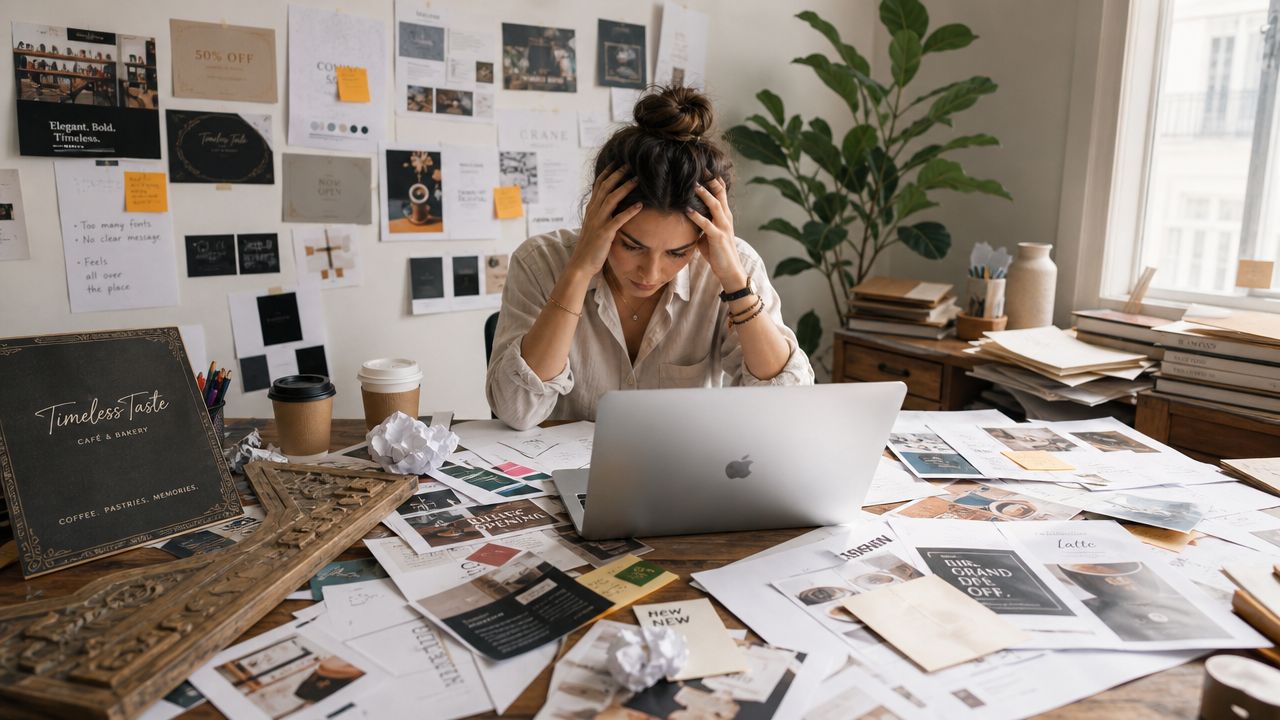
That's the trap. A creator posts one clean reel with warm lighting, then follows it with a flat overhead photo, then a podcast clip in a totally different aesthetic, then a product shot with props that don't belong to the same world. Nothing is technically broken, but the brand never builds momentum because the audience never gets a stable visual identity to recognize.
DIY styling breaks down fast
The first version of an antique kitchen menu usually fails for one of two reasons. It's either too theatrical or too vague.
Too theatrical means burned edges, fake cursive, overdone distressing, and language that sounds like a movie set version of history. Too vague means a beige card with “old-timey” fonts and no real point of view. Neither reads as premium. Both make the content feel staged in the wrong way.
A better approach is to treat the prop like a historical document. Research from In the Vintage Kitchen on vintage menu research recommends cross-checking item names against period recipe sources, and notes that vintage menus commonly featured dishes such as shirred eggs, Saratoga chips, and Spring lamb chops. That's a practical filter. If the wording, dish names, and sequencing don't fit the era you're referencing, the prop starts working against your credibility.
What inconsistency costs you creatively
When your visuals shift every time you post, you create extra work at every stage:
- Planning gets slower because every shoot starts from zero instead of building from a repeatable style system.
- Editing gets harder because clips don't naturally belong together.
- Your audience does more work trying to understand whether they're looking at a food brand, a lifestyle brand, a podcast, or a personal scrapbook.
- Premium positioning weakens because luxury rarely looks accidental.
Branding becomes operational, not cosmetic. Strong visual systems help teams move faster because more decisions are already made.
If your content still feels scattered, this breakdown of how to brand your business can help clarify the gap between “looks good” and “feels like us.”
A brand style isn't just a logo and palette. It's the repeated proof that you know what belongs in your frame and what doesn't.
Elevate Your Brand with a Flexwork Content Day
There's a point where doing everything yourself stops being resourceful and starts diluting the work.
A focused production day solves that. Instead of improvising props, locations, framing, and deliverables across several weekends, you build one tight concept and capture a library of assets around it. For an antique kitchen menu concept, that means the menu isn't a one-off craft project. It becomes the hero object for close-ups, tabletop shots, host intros, B-roll, and promo clips.

A Content Day is $3000/day and includes 20 edited reels or 60 pro photos, according to the Content Day for podcasters page. That structure matters because prop styling works best when it's planned for output, not just aesthetics. One menu can support a launch teaser, behind-the-scenes stills, branded episode artwork, sponsor-friendly social clips, and evergreen website imagery if the shoot is designed properly from the start.
Why a prop like this performs well in batch production
An antique menu gives you range without visual chaos. You can style it flat on a table, half-visible beside a coffee cup, held in hand during an intro, or layered into a wider kitchen scene.
It also gives talent something to do. That's a bigger advantage than most creators realize. Hands look more natural when they're opening, pointing, tracing a line of text, or placing a menu down between talking points.
Here's what tends to work best in a Content Day setup:
- Hero framing: One polished setup where the menu is clearly readable and central.
- Support shots: Cropped compositions where only the texture, typography, or edge detail appears.
- Motion moments: Simple interactions like unfolding, setting, sliding, or referencing the menu on camera.
Designing Your Antique Menu Mood and Research
The design starts before Photoshop, Canva, or printing. It starts with a decision about what antique means in your brand world.
Pick an era before you pick a font
“Antique” is too broad to be useful on its own. It might suggest a formal dining room, a diner-inspired menu format, or a retro brand identity. That ambiguity also manifests itself. Michigan's listing for Antique Kitchen in Portage describes a family restaurant that has operated since 1971, which is a good reminder that the word “antique” in branding doesn't automatically signal a specific historic period.
That's why the first creative decision should be one of these:
-
Historic dining reference
You're drawing from a documented period and want the menu to feel archival. -
Retro hospitality look
You want nostalgia without strict historical reconstruction. -
Brand theater
You're using “antique” as an aesthetic mood, not a claim of authenticity.
If you skip that choice, the final prop confuses the viewer. It might look old, but it won't say anything coherent.
Creative checkpoint: Define the decade, room type, and customer persona for the menu before you design a single line.
Build a mood board with real-world constraints
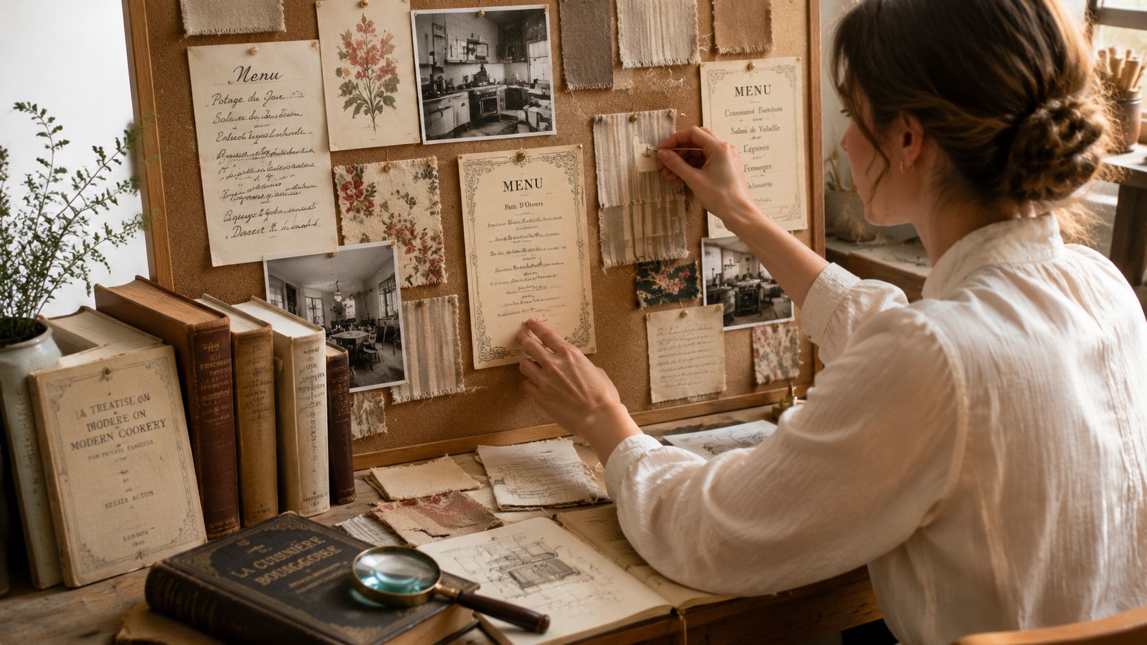
A strong mood board needs more than screenshots of pretty menus. Include surfaces, lighting references, dish naming style, typography, paper color, wear pattern, and how the object will be handled on camera.
I like to divide references into three buckets:
| Bucket | What to collect | Why it matters |
||—|—|
| Historical cues | Menu layouts, dish names, border styles | Keeps the prop grounded |
| Set cues | Countertops, dishware, linens, wood tones | Makes sure the menu belongs in the scene |
| Performance cues | Hand poses, table interactions, close-up crops | Helps the prop work on camera |
If your content also touches interior storytelling, it helps to visualize your next traditional kitchen remodel so your prop design matches the broader room language instead of fighting it.
A moving reference can sharpen your taste faster than static images alone. This walkthrough is useful when you want to study how vintage kitchen details read in motion.
Research for believability, not perfection
You don't need museum-level reconstruction for branded content. You do need internal consistency.
That means your menu language, paper choice, and distressing style should agree with each other. A carefully typeset formal menu on deliberately wrinkled craft paper usually feels wrong. A diner-style breakfast list with ultra-luxury calligraphy feels wrong too.
A useful shortcut is to ask three questions before locking the concept:
- Would this menu plausibly exist in the room I'm showing?
- Would the dishes and wording fit the era I'm referencing?
- Would someone on camera interact with it naturally?
For set-building inspiration beyond the prop itself, this collection of podcast studio design ideas can help you think about how furniture, props, and backdrop choices work together.
A Production Guide From Layout to Finishing Touches
Execution is where most antique menu concepts either become convincing or collapse into costume.
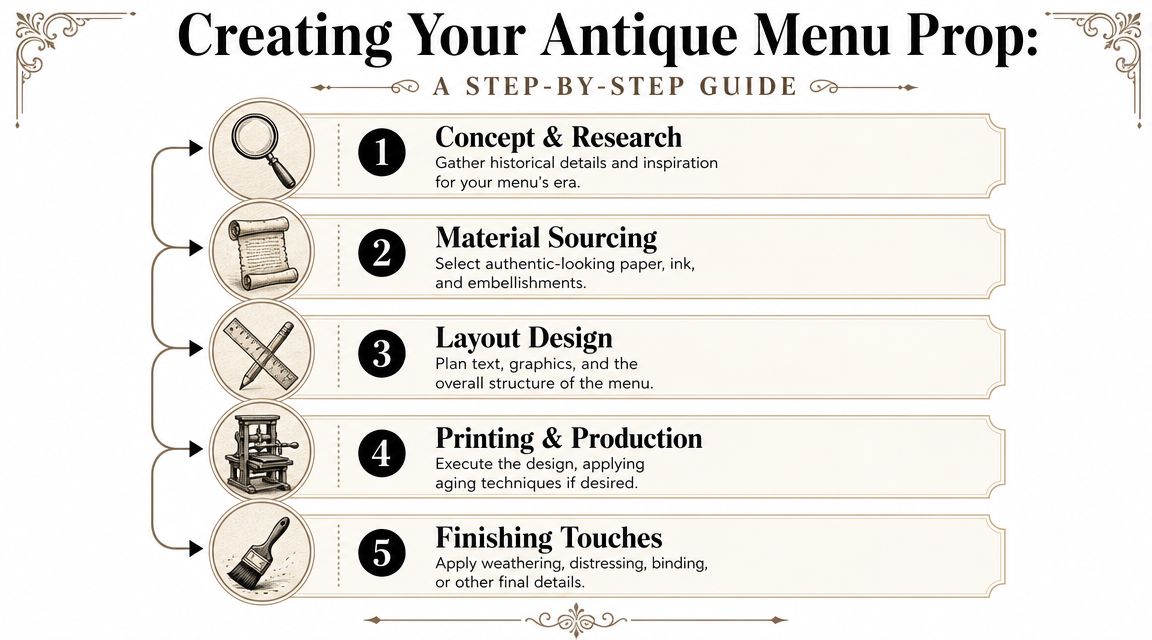
Start with layout, not effects
The fastest way to cheapen a vintage prop is to rush into stains, overlays, and edge damage before the composition works. Build the structure first.
For an antique kitchen menu, focus on these layout elements:
- Hierarchy: Title, meal sections, featured dishes, and prices or descriptors should read in a clear order.
- Margins: Older menu styles often breathe more than modern flyers. Give the page room.
- Ornament restraint: One border, one divider style, one decorative motif. More than that gets noisy.
If you're unsure whether the menu will read on camera, print a rough draft early and film it under the same kind of lighting you plan to use. Detail that looks elegant on screen can disappear under bright key lights or glare from glossy stock. Understanding lighting choices for video recording proves beneficial. Texture only helps if the camera can see it.
Less distressing and better layout usually beats more distressing and weaker design.
Choose typography that fits the story
Vintage doesn't mean unreadable. Your fonts need personality, but they still have to survive mobile screens and quick cuts.
A good working mix often looks like this:
- Display font for the title that signals the era
- Readable serif for dish names to keep the body elegant
- Simple secondary type for small notes, subheads, or service details
Avoid stacking too many expressive fonts. One strong title face can carry the period feel. The body should do the practical job.
Make the aging believable
Restraint is most important. Artificial wear should follow logic. Real menus age at folds, corners, edges, and handling points. They don't usually age in a perfectly even brown wash.
Use a combination of digital and physical methods:
-
Digital texture first
Add subtle grain, softened contrast, or a faint paper overlay before printing. Keep it light. -
Print on the right stock
Warm white or cream paper tends to photograph better than bright office white. -
Physical weathering second
Fold and unfold. Lightly soften corners. Add handling wear where fingers would naturally touch. -
Test in camera
Some distressing reads beautifully in person and muddy on video.
Finish for the set, not the craft table
A prop for content production has different priorities than a prop for a shelf. It needs to be durable enough to handle, matte enough to avoid glare, and legible enough to survive cropped edits.
A few finishing options work especially well:
| Finish choice | Best use | Watch-out |
||—|—|
| Cream cardstock | Clean vintage look on camera | Can feel too new without texture |
| Matte specialty paper | Better texture response | Some stocks curl under handling |
| Folded menu format | Great for interaction shots | Inner panels must be designed too |
| Single-sheet broadside | Best for overhead flat lays | Less dynamic in hand |
If you don't want to design from scratch, pre-made templates from marketplaces can help. Just don't use them untouched. Change the dish list, rebalance the spacing, and adjust the texture so the prop belongs to your brand instead of looking like a downloadable file.
A convincing prop doesn't announce the work. It lets the viewer assume it has always existed in that world.
Bring Your Vision to Life at Flexwork Studios
An antique kitchen menu seems small until you see what it does on camera. It adds narrative, gives your hands purpose, creates texture in close-up shots, and tells the viewer your brand has taste beyond the obvious. That's the difference between content that looks assembled and content that feels directed.
The process is straightforward when you respect the sequence. Define the era. Research the wording. Build a mood board that includes the room, not just the paper. Design the layout before adding wear. Test it under real lighting. Then shoot it in a way that turns one prop into a full library of visual assets.
You can absolutely make this yourself. But if you're tired of spending your weekends styling, printing, reshooting, and second-guessing every frame, a professional production environment changes the experience. Better sets, better lighting, better pacing, and a cleaner plan let the prop do what it's supposed to do. Support the story instead of stealing attention from it.
If you're ready to turn an idea like this into polished, on-brand content, book a tour with Flexwork Podcast Studios. It's the fastest way to move from DIY experimentation to a production setup built for premium reels, photos, and podcast visuals.