8 Video Production Company Logo Ideas for 2026
Meta description: Video production company logo ideas that help podcasters look premium, attract better opportunities, and grow with a stronger brand system.
URL slug: /video-production-company-logo-ideas
Primary keyword: video production company logo
Secondary keywords: podcast branding, production company logo design, podcast studio branding
Your Brand Is Your Most Important Episode
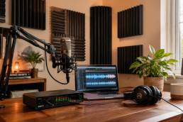
Your podcast can be performing well and still look like it belongs to an earlier version of your business. The audio is cleaner now. Your interviews are stronger. Your audience trusts you. But if your logo, thumbnails, website, and promo assets still feel improvised, people notice. Sponsors notice. Guests notice. New listeners notice.
That gap between your content quality and your visual identity is where growth starts to stall. A weak brand system makes a serious show feel small, even when the work is excellent. The production logo has long served as a formal brand signal in film and television, identifying who made the work and helping establish the production company and distributor, which is why it has remained a standard part of screen media for decades, as outlined in the production logo overview.
That's exactly where Flexwork Studios fits. A sharp video production company logo can open the door, but real brand elevation happens when that mark carries through your full ecosystem. Flexwork can support that rollout through a Podcast Website for $5000 plus hosting, a Content Day for $3000, or ongoing support through the Market, Manage & Produce My Podcast package, which starts at $1500 per episode with a 20-episode growth commitment. If you want a larger framework for video-led growth, this guide for marketing professionals is a useful companion read.
1. The Play Button Symbol Logo
The play button works because nobody has to decode it. It tells people you publish, distribute, and move content. That instant recognition matters when someone finds your brand in a crowded feed, a YouTube banner, or a podcast trailer cover.
That doesn't mean you should settle for a generic triangle. The basic shape is common, so your edge comes from how you customize it. The strongest versions use negative space, a distinctive cut, or a second symbol that reflects your niche. A creator with a business podcast might fuse a play icon with a monogram. A studio-first brand might soften the triangle inside a framed mark so it feels less platform-dependent.
![]()
Make It Look Owned, Not Borrowed
YouTube, Vimeo, Spotify, and Apple Podcasts have trained audiences to understand the play symbol fast. That's the benefit. The risk is sameness.
Use these moves to make the icon yours:
- Add a brand-specific frame: Place the play symbol inside a badge, speech bubble, camera crop, or initials-based container.
- Use intentional negative space: A hidden letterform or directional cut can give the mark memorability without making it busy.
- Design for motion first: The logo should enter cleanly in a short intro and still hold up as a static favicon.
- Build a hybrid system: If your show lives in both podcast and video formats, connect the play icon to your audio identity rather than treating it as video-only.
Practical rule: If your logo could be mistaken for a random app icon, it isn't ready.
A play-button-based video production company logo is especially effective for creators who need clarity fast. If you host interview clips, social trailers, and full episodes across multiple platforms, this mark gives you instant category recognition. It's a smart choice when your priority is discoverability, not mystery.
2. The Film Reel / Circular Motion Logo
Some logos say “we publish.” A film reel or circular motion mark says “we produce.” That's a different message, and it's often the better one if you want your brand to feel established, process-driven, and premium.
Circular marks carry a sense of continuity. They suggest systems, repeatability, and a content engine that keeps moving. That's useful for podcasters building a media brand, not just posting episodes one at a time. If your business includes recurring interviews, seasonal campaigns, branded series, or client-facing production services, this concept can frame you as a company rather than a creator with a microphone.
Use the Retro Cue Without Looking Dated
Film imagery can drift into nostalgia fast. That's fine if you run an auteur-led studio or documentary brand. It's less useful if your audience expects a modern, digital-first presence.
Keep it current with a few design decisions:
- Simplify the reel: Reduce the visual noise so the logo still reads at small sizes.
- Lean on clean geometry: A circle with selective reel references feels sharper than a literal old-school strip.
- Test in one color first: If the logo fails in black and white, it won't survive every use case.
- Animate with restraint: A subtle rotation or pulse feels polished. Overbuilt motion feels like a gimmick.
One reason this concept deserves serious attention is that the media environment is expanding fast. One industry report estimated the global video production market at $70.40 billion in 2022 and projected $746.88 billion by 2030, with a 33.5% CAGR from 2023 to 2030. In a market that large, brands that signal production value clearly have an easier time standing out.
A circular logo also behaves well across merch, mic flags, profile icons, and watermark treatments. If you want your identity to feel like a seal of quality, not just a decorative badge, this is a strong route.
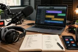
3. The Microphone + Camera Hybrid Logo
This is one of the clearest logo directions for modern podcasters because it reflects how the business works now. You're not just recording audio. You're capturing a full content library. Long-form episodes become reels, clips, quote graphics, and short-form video. Your logo should acknowledge that reality.
A microphone plus camera mark tells clients, guests, and sponsors that your brand lives at the intersection of voice and visuals. That's useful if you rent studio time, produce interview content, or want your show to look bigger than a traditional audio-only podcast.
![]()
Balance the Two Symbols
Most hybrid logos fail because one side dominates. The camera becomes obvious and the mic disappears, or the mic is so literal that the brand starts to look like karaoke equipment. You need equal visual weight.
A few rules make this concept stronger:
- Match line style: If the camera is angular, don't pair it with an overly rounded microphone illustration.
- Protect the spacing: The negative space between the two elements should feel intentional, not accidental.
- Create a small-size version: At favicon size, the full hybrid may collapse. Build a simplified mark for tight placements.
- Check the gear language: If your audience is serious about video, the visual reference should feel current, not outdated.
If you're still deciding what your production setup should look like, Flexwork's breakdown of the best camera for video podcasting helps connect brand ambition to practical gear choices.
A hybrid logo works best when your business model is hybrid too. Recording, repurposing, clipping, and distributing should all feel native to the brand.
This concept is particularly strong for creators who are transitioning from solo podcast host to studio-backed media brand. It tells the market that your show isn't only heard. It's seen.
4. The Studio Window / Frame Logo
A studio window logo is a power move for businesses with a real place behind the brand. It signals environment, control, and production context. For a creator who wants to be known for polished in-studio conversations, a frame-based mark can communicate professionalism before anyone sees the set.
The frame can be literal or abstract. It might look like a window, a sound booth panel, a camera monitor, or a stage portal. What matters is the implication. The frame captures ideas. The frame allows guests to step into your world.
Turn Space Into a Selling Point
A lot of creators underestimate how much trust a physical studio creates. A strong frame logo can reinforce that trust, especially when paired with high-quality photography, booking pages, and behind-the-scenes clips.
Use this idea well by focusing on contrast:
- Inside versus outside: The logo should hint at transformation. Outside is noise. Inside is clarity.
- Light and composition: A frame suggests curation. Use it to imply focus, not confinement.
- Architectural simplicity: Clean edges age better than trendy decorative details.
- Place-based branding: If your studio itself is part of the offer, let the logo support that story.
Creators shopping for a dedicated set or local recording space should look at Flexwork's video podcast studio near me guide, especially if the goal is to align visual identity with a professional recording environment.
This logo style works well for boutique production houses, branded podcast teams, and creators who host in-person interviews. It says your brand has a home, and that home has standards.
5. The Abstract Waveform Logo
If the play button says distribution and the frame says environment, the waveform says signal quality. It points to audio precision, rhythm, and presence. For a podcast brand, that's a strong foundation.
The best waveform logos don't mimic a random soundbar screenshot. They abstract the idea into something ownable. Think controlled repetition, distinctive spacing, and a shape that can live as both icon and pattern. Done well, this style feels modern without trying too hard.
Keep It Simple Enough to Scale
Waveforms can get messy quickly. Tiny fluctuations that look clever on a full monitor become visual fuzz on mobile. Strip the concept down until it still feels strong in one color and at small sizes.
A few useful filters:
- Choose one waveform logic: Symmetrical, staggered, or pulse-based. Don't combine all three.
- Avoid over-detailing: A logo is not an equalizer plugin.
- Make it brandable as a pattern: The mark should extend naturally into thumbnails, lower thirds, and social templates.
- Plan the motion version early: A waveform that animates into place can make a great opener if the movement feels disciplined.
This direction also aligns with current business reality. One 2025 roundup reported that 86% of businesses use video as a marketing tool and 90% of marketers say brand video production has significantly increased brand awareness. If your podcast is part of your marketing engine, a waveform-based video production company logo can bridge voice-led authority with visual-led growth.
For creators whose brand promise centers on clarity, insight, and smart editing, this concept usually lands better than a more literal media icon.
6. The Geometric / Negative Space Logo
This is the most brand-strategic option on the list. A geometric or negative space logo doesn't just identify your category. It gives your brand an idea. That matters when you're building something meant to last.
This style works especially well for founders, consultants, and hosts who want their podcast brand to feel premium enough to expand into events, products, courses, or a broader media company. The mark can start in content and scale into a larger business without feeling boxed into one format.
![]()
Build for Longevity, Not Applause
Trend-driven logos often get attention in the short term and become expensive liabilities later. A stronger move is to create a mark with enough structure to evolve subtly over time.
That matters because one underserved industry angle points to a real branding problem: 65% of small businesses in major markets replace logos every 3 years due to trend pressure, a 2025 Nielsen study found a 38% decrease in brand recall for companies that frequently change logos, and 28% of stable video studios adopted adaptive logos in the last 12 months. The smarter play is consistency with refinement, not constant reinvention.
If you're refining your broader identity, Flexwork's guide on how to brand your business is a useful next step.
Strategic lens: A great negative space logo gives you a story to tell, a system to scale, and fewer reasons to redesign when trends shift.
Choose this route if you want the most timeless option. It asks more from the design process, but it usually returns more business value over time.
7. The Dynamic Gradient / Multi-Color Motion Logo
Some brands need restraint. Others need visible energy. If your show lives on short-form video, creator-led launches, and social-first promotion, a dynamic gradient logo can feel alive in the right way.
This style suits hosts who want momentum to be part of the brand. The logo feels in motion even when it's still. That can be useful if your audience skews digitally native and expects a brand system that moves cleanly across reels, teaser edits, and animated intros.
A motion-first example helps here:
Make Motion Serve Recognition
A lot of colorful logos look exciting for a week and then start to age. The fix is discipline. Limit the palette, control contrast, and make sure the core shape still works without effects.
There's also a technical upside to designing this style properly. Brand identity audits for video production agencies found that logos designed with a 3:2 aspect ratio and motion-friendly vector paths had a higher retention rate during short animated intros than square-layout logos. The same body of data found that switching from static, pixel-based logos to scalable SVG logos with motion-triggered anchor points improved perceived technical proficiency in a field study of production firms. That's useful context if your brand lives heavily in animated environments.
If motion branding is part of your growth plan, Flexwork's article on how to create motion graphics connects the visual side to practical execution.
This route works best when your brand already behaves dynamically. If your clips are high-frequency, your set design is bold, and your growth strategy depends on visual velocity, let the logo match the pace.
8. The Personified / Character-Based Logo
A character logo is the least corporate option here, and that's exactly why it can work. If your podcast runs on personality, point of view, humor, or a founder-led voice, a personified mark can create emotional memory that a polished abstract symbol never will.
This approach is stronger than many people assume. One underserved angle in branding points to a growing tension between polish and credibility. Data cited in that discussion says 78% of creators in the US and EU report that overly corporate logos reduce perceived authenticity, while hand-drawn or artisan-style logos saw a 42% increase in adoption among indie video studios over the last 12 months. That tells you something important. Looking expensive isn't enough if the brand stops feeling human.
Make the Character Carry the Brand
A mascot or illustrated identity needs more than charm. It needs a role. Is the character a host surrogate, a symbol of your audience, or a visual shorthand for your values? Decide that first.
Then build consistency around it:
- Define its personality: Calm, witty, sharp, disruptive, warm.
- Create repeatable poses: The logo should extend naturally into thumbnails and campaigns.
- Keep one core silhouette: Distinctiveness matters more than decorative detail.
- Plan for evolution: The character can mature with the brand, but it shouldn't change so much that recognition drops.
For creators building a fuller visibility strategy around personality-led content, Flexwork's guide to video content marketing strategy is a practical companion.
Don't choose a character logo because it's cute. Choose it because your audience buys into a voice, and the brand should make that voice visible.
This concept is ideal for creator businesses where relatability is part of the product. Coaching brands, culture shows, comedy formats, and founder-driven media brands often get the most from it.
8-Style Video Production Logo Comparison
| Design | Implementation complexity | Resource requirements | Expected outcomes | Ideal use cases | Key advantages |
|---|---|---|---|---|---|
| The Play Button Symbol Logo | Low, simple geometry; needs differentiation to avoid generic look | Low, basic vector + optional animation | Immediate video recognition; highly memorable but common | Favicons, app icons, social profiles, video intros | Universal symbol, scalable, easy to animate |
| The Film Reel / Circular Motion Logo | Medium, circular/detail balance; animation-friendly | Medium, vector + motion graphics; careful simplification for small sizes | Conveys motion and production heritage; professional storytelling | Production companies, animated intros, film-focused branding | Strong motion metaphor, professional and narrative-driven |
| The Microphone + Camera Hybrid Logo | Medium–High, requires balanced integration of two elements | Medium, skilled designer, simplified small-size variants, optional motion | Clear communication of dual audio/video services; highly relevant | Hybrid studios, podcast+video service pages, marketing materials | Directly conveys full-service production; differentiates from single-focus brands |
| The Studio Window / Frame Logo | Medium, geometric/architectural refinement needed | Medium, vector work, signage mockups, environmental applications | Emphasizes physical space and professionalism; location credibility | Brick-and-mortar studios, signage, facility promotion, wayfinding | Highlights studio quality, works well for signage and place-based trust |
| The Abstract Waveform Logo | Low–Medium, must be simplified for clarity at small sizes | Low, vector + animation tests; ensures reproducibility | Modern audio-focused impression; dynamic and tech-forward, may date | Podcast branding, audio apps, animated intros and overlays | Signals audio quality, animation-ready, contemporary feel |
| The Geometric / Negative Space Logo | High, requires strong conceptual design and precision | High, experienced designer, extensive guidelines and testing | Timeless, premium perception; may not immediately read as "video" | Premium positioning, agencies, broad brand identity systems | Highly distinctive, very scalable, professional and elegant |
| The Dynamic Gradient / Multi-Color Motion Logo | Medium, color system and motion planning required | Medium–High, gradient systems, motion assets, accessible variants | Energetic, contemporary digital presence; trend-driven risk | Social media, digital marketing, youth-focused platforms | Vibrant, attention-grabbing, excellent for social and motion |
| The Personified / Character-Based Logo | High, illustration, personality development, multiple assets | High, illustrators, character sheets, expression sets, long-term upkeep | Strong emotional connection and memorability; may constrain scope | Community-facing campaigns, social content, brand mascots | Highly memorable, humanizes brand, flexible storytelling and expression |
Your Logo Is the Doorway to Your Brand
A logo is never just a logo. It's an opening signal. It tells people whether your show is a side project, a serious media property, or the beginning of a much larger business. In a crowded market, that first signal shapes the kinds of opportunities that come toward you.
A strong video production company logo does three jobs at once. It clarifies what you make. It reflects the level you operate at. It gives every other brand asset a center of gravity. Your website, studio photography, trailers, episode art, guest decks, and sponsor materials all become more convincing when the logo anchors them with intention.
That's why smart creators don't treat logo design as a standalone task. They treat it as part of a system. If your identity changes, your online presence should evolve with it. Your episode visuals should match it. Your content pipeline should amplify it. A logo without rollout is unfinished work.
Flexwork Studios is built for that kind of follow-through. If you need a sharper digital home, a Podcast Website is available for $5000 plus hosting. If you need a bank of polished visuals fast, a Content Day is $3000 and can generate a broad set of brand-ready assets. If your bigger goal is audience growth, ongoing production, and stronger market positioning, the Market, Manage & Produce My Podcast package starts at $1500 per episode with a 20-episode commitment.
Many creators level up. They stop thinking in isolated assets and start building a brand world. The logo becomes the entry point, not the finish line. That shift makes your podcast easier to trust, easier to remember, and easier to monetize.
If you're weighing your next brand move, it also helps to study adjacent branding work outside podcasting. This perspective on branding for e-commerce and startups is useful because the same principle holds across categories: the visual identity has to support commercial growth, not just look good on launch day.
Ready to create a visual identity that reflects the quality of your content? Explore Flexwork's production support, website builds, and studio services, or book a tour of the Springfield, New Jersey space. Build a brand that looks as strong as your next season sounds.
If you're ready to turn a good show into a sharper brand, Flexwork Podcast Studios can help you connect your logo, studio presence, content assets, and growth strategy into one cohesive system.