
Podcast Cover Art Design Your Listeners Will Love
 June 17, 202619 Minutes
Meta description: Podcast cover art design drives first impressions, clicks, and brand trust. Learn what works, what hurts growth, and how to build it right.
URL slug: /podcast-cover-art-design
Primary keyword: podcast cover art design
Secondary keywords: podcast artwork, podcast branding, podcast cover art
You've probably felt this already. The audio is strong, the guest was sharp, the conversation delivered, and the edit sounds clean. Then the show goes live and nothing moves the way it should.
That stall often starts before anyone presses play. In podcast apps, listeners don't hear your work first. They see it. Your cover art sits in a grid of tiny competing thumbnails, and in that moment your show is being judged on taste, clarity, and credibility.
That's why podcast cover art design isn't a side task to knock out in Canva at midnight. It's a conversion decision. It shapes whether your show looks established or improvised, whether your brand feels considered or inconsistent, and whether the right listener thinks, “this is for me.” For creators building serious media brands, that visual layer needs the same level of intention as your audio, your clips, and your website.
Your Podcast's First Impression Is Visual
Strong shows get ignored every day because the packaging doesn't signal quality. That's the uncomfortable truth. Listeners scroll fast, compare fast, and make assumptions fast.
Buzzsprout reports that 62% of new listeners are more likely to listen if they like a podcast's cover art, which is why artwork should be treated as a growth asset, not decoration. The same guidance also points to a redesign case study where a cover art refresh helped boost growth by 45% in one month and added more than 2,000 downloads per episode in that example, as discussed in YouTube's podcast design guidance.
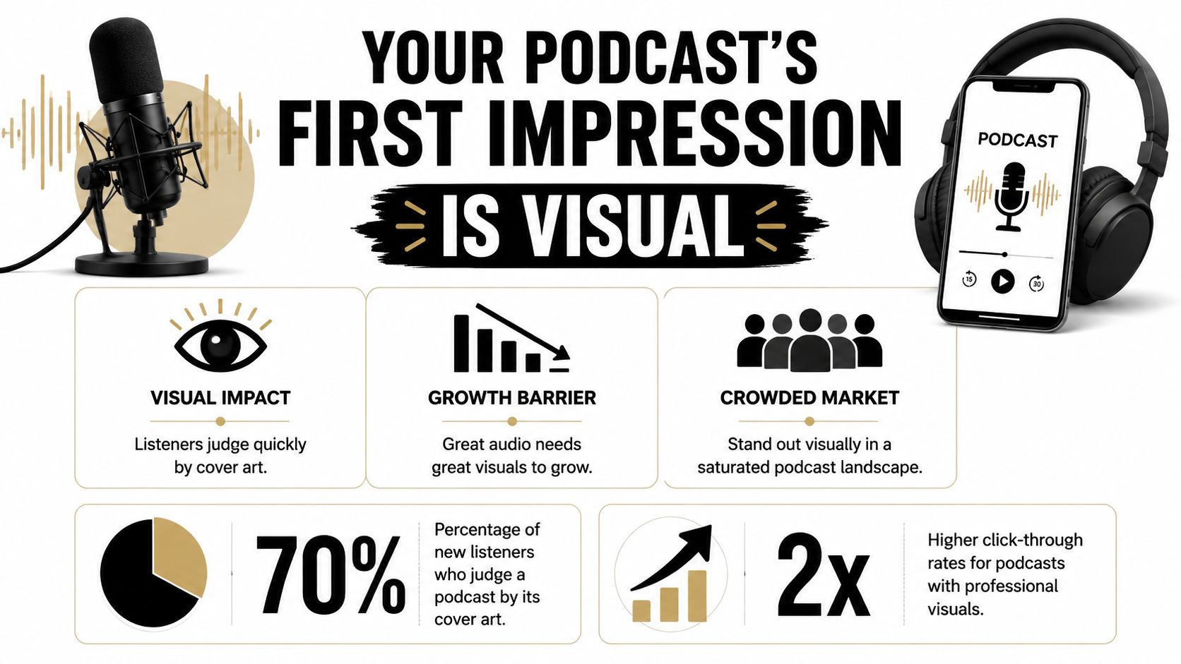
A lot of podcasters think of artwork as a branding accessory. It isn't. It's the visual shorthand for your show's standards. If the cover looks dated, cluttered, or generic, people assume the production may feel the same way.
What weak cover art signals
- DIY fatigue: The show may be active, but the brand looks patched together.
- Unclear positioning: Listeners can't tell if the show is insightful, entertaining, niche, premium, or beginner-level.
- Low trust: Sponsors, guests, and collaborators notice visual inconsistency too.
Practical rule: If your cover art only works when viewed large on a desktop, it's already failing in the places most people discover podcasts.
There's also a bigger brand question. If your trailer promises polish but your artwork feels forgettable, the identity breaks. A strong launch usually pairs visual clarity with messaging clarity, which is why an effective podcast trailer strategy matters alongside cover art.
For founders and hosts refining the bigger picture, Flexwork has also written about how visual consistency shapes market perception in its guide to branding your business. The principle applies directly here. People don't separate your art from your authority. They read them together.
The Flexwork Solution for a Polished Brand
Professional podcast branding doesn't live in one file. It lives in the system around the show. Your cover art, episode visuals, studio look, social clips, website, and voice all need to feel like they come from the same world.
That's where many ambitious podcasters hit a ceiling. They can design a decent square image, but they can't maintain a premium identity across every touchpoint while also booking guests, recording, editing, distributing, and marketing the show. The problem isn't effort. It's fragmentation.
A premium brand needs an ecosystem
A polished podcast brand usually includes:
- A clear visual language: Cover art, thumbnails, lower thirds, and social graphics should feel related.
- A controlled production environment: Lighting, framing, sound, and set design all affect how premium the brand feels.
- A repeatable content engine: The look of the show has to survive beyond launch week.
For creators who want execution support, Flexwork Podcast Studios offers studio production, editing, branding support, content capture, and podcast websites. That matters because cover art lands harder when the rest of the brand looks equally resolved. If you're building out that visual system, this guide on custom studio assets for your podcast brand is a practical place to start.
The service mix matters too. A Content Day is $3000/day and includes 20 edited reels or 60 pro photos. That's useful when your cover art needs supporting visuals that match it. Podcast websites are $5000 plus hosting, which gives your show a proper home instead of sending people from a strong thumbnail to a weak landing experience. For operators focused on growth, the Market, Manage & Produce My Podcast offer starts at $1500 per episode with a 20-episode growth commitment. That turns branding into an ongoing operating system instead of a one-time design task.
A lot of teams also use tools to extend each recording into social content. If you're cutting short-form clips from long-form episodes, Klap's podcast clipping tool is one example of how creators repurpose studio footage into assets that need to remain visually consistent with the core show identity.
Here's how that studio environment looks in motion:
A premium show doesn't just sound organized. It looks organized everywhere the audience meets it.
The Unbreakable Rules of Cover Art Design
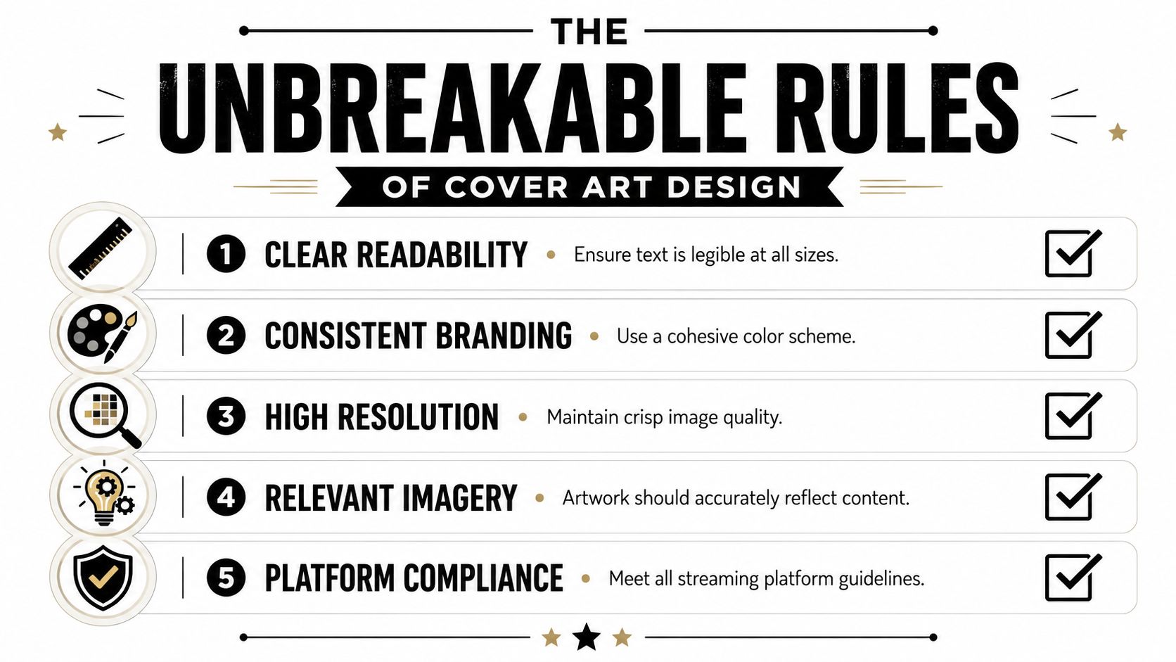
Podcast cover art design has creative room, but the foundation is not subjective. Platforms have requirements, and mobile behavior punishes artwork that ignores them.
Apple Podcasts requires artwork to be square, with a minimum size of 1400 x 1400 pixels and a maximum of 3000 x 3000 pixels. Podcast design guidance commonly recommends 72 dpi and JPG or PNG formats, and many creators design at 3000 x 3000 for the cleanest output. That guidance also recommends keeping text to seven words or fewer because artwork is often viewed at very small sizes in apps, where tiny copy and detailed imagery lose clarity, as explained in Shutterstock's podcast cover art guide.
Start with the non-negotiables
| Rule | What to do | Why it matters |
|---|---|---|
| Format | Use a square canvas | Podcast directories display cover art as a 1:1 asset |
| Size | Design large within accepted platform specs | Small files can look soft or constrained |
| Text | Keep wording short | Long titles collapse into unreadable blur on mobile |
| Contrast | Push separation between foreground and background | Thumbnails need immediate readability |
| Simplicity | Strip away minor decorative details | Small screens erase nuance first |
Audit your cover at thumbnail size
Most design mistakes don't appear when the artwork is full-screen. They appear when the art is reduced to a tiny tile beside ten other shows.
Use this test:
- Shrink it aggressively: View the art at mobile thumbnail size.
- Step back: If the title disappears, the hierarchy is wrong.
- Squint: If the concept becomes muddy, the contrast is too weak.
- Compare it: Place it next to covers in your category and see whether it still reads as distinct.
Good podcast artwork communicates before it decorates.
The strongest covers usually rely on one dominant idea. That could be a host portrait with clean typography, a bold typographic mark, or a simple graphic symbol. What doesn't work is trying to tell the whole story in one square. Mini scenes, multiple focal points, and overloaded taglines almost always collapse under scale.
What to remove before you publish
- Tiny subtitles: They rarely survive app thumbnails.
- Busy backgrounds: Texture can be useful, but clutter kills legibility.
- Stock visual clichés: Generic microphones and headphones often make a show look interchangeable.
- Too many promises: Your cover isn't a flyer. It's an identifier.
A better approach is to let your title do one job, your image do one job, and your color do one job. If every element is shouting, none of them is leading.
For creators thinking beyond the square, the same discipline applies to episode concepts and promotional narratives. Flexwork's perspective on creating compelling content that captivates your audience aligns with this. The clearer the core idea, the stronger the audience response.
Mastering Typography Color and Imagery
Once the technical rules are locked, the core brand work begins. Podcast cover art design then transitions from compliance to identity.
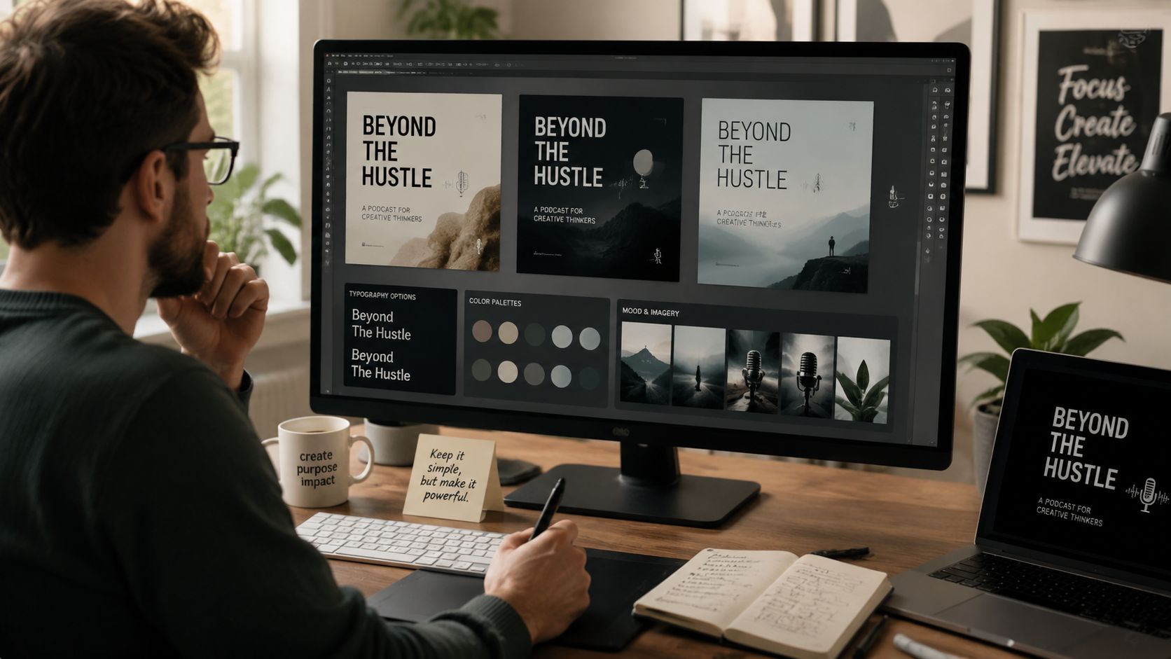
Podcast marketing guidance consistently stresses that artwork should be built for tiny-screen recognition, not just for aesthetics. That means using strong contrast, limited text, and avoiding generic imagery so the design still functions in crowded app views and clipped video promotions, as noted by Captivate's podcast cover art design guidance.
Typography decides the tone before anyone listens
Type is often the first brand signal a listener reads. A condensed sans serif can feel modern and assertive. A refined serif can feel editorial or intellectual. A playful rounded face can work for personality-led formats, but it can also make a serious business podcast feel underpowered.
Use these filters when choosing type:
- Authority: Does the font look stable and intentional?
- Recognition: Does the title remain readable at a glance?
- Personality: Does it match the show's actual tone, not the one you wish it had?
If your show title is long, hierarchy matters more than style. Sometimes the smartest move is emphasizing one keyword and reducing the rest. Elegant restraint beats crowded completeness.
Color should separate you from the category
Many creators pick colors based on personal taste. That's a weak method. Your palette needs to perform in context.
If your category is filled with dark covers, a clean bright palette can create instant separation. If the market leans soft and pastel, a sharper high-contrast direction may earn more attention. The point isn't to be loud. The point is to be identifiable.
For a useful primer on colour's role in brand identity, this DesignGuru article helps frame why color is never just decorative. In podcasting, color often becomes the fastest recall cue a listener has.
Choose colors for recognition first, preference second.
Imagery should clarify the promise
There are three common directions, and each creates a different impression:
- Host photo: Best when the host is the brand, the face is already part of the audience relationship, or the show depends on personality and trust.
- Illustration: Useful when you want a distinctive style, a less literal mood, or a concept that photography can't express cleanly.
- Abstract or typographic concept: Strong for minimalist brands, niche authority shows, or formats where the title carries the weight.
Avoid choosing imagery just because it looks polished in isolation. Ask whether it makes sense at thumbnail size and whether it creates memory. A beautiful image that says nothing specific about the show is still a weak brand asset.
If you're using a host image, quality matters. Poor lighting, casual cropping, or mismatched styling can cheapen the whole presentation. That's one reason professional photo support matters for podcast brands. Flexwork's Sky Studios photography work is relevant here because strong portraits don't just support websites and press kits. They can anchor an entire cover art system.
Tools Templates and Critical Legal Guardrails
Design tools are more accessible than ever. Canva and Adobe Express make it easier to draft concepts, test layouts, and explore direction without opening a full Adobe workflow. That accessibility is useful, but it also creates a false sense of completion. Easy assembly isn't the same as professional resolution.
Templates help with speed. They don't solve for originality, category differentiation, or visual hierarchy. Many podcasters start with a decent template and then overload it with extra text, weak photos, and borrowed visual trends that don't fit the show.
The overlooked issue is rights
The bigger risk often isn't aesthetic. It's legal. Rights and licensing are a frequently overlooked part of podcast cover art design, especially when creators use stock photos, AI-generated visuals, or freelance designers. Apple's artwork guide focuses on format and placement rules, but it does not tell you what rights you need to secure for the visual itself. That gap can expose creators to rework, takedowns, or legal trouble, as reflected in Apple's artwork guide.
Ask these questions before launch:
- Stock image use: Does your license cover podcast branding and distribution?
- AI imagery: What do the platform terms allow, and are there usage restrictions?
- Freelance design: Did the designer transfer the necessary usage rights to you?
- Typography licenses: Are the fonts cleared for commercial brand use?
If you can't confirm the rights chain, you don't fully own the asset you're publishing.
Creators building a broader content workflow may also want a practical stack for production, editing, and publishing. Flexwork has a useful roundup of tools for content creators that helps frame where DIY tools fit and where professional oversight becomes worth it.
Your Professional Podcast Brand Starts Here
The strongest podcast cover art does three jobs at once. It meets platform requirements, reads instantly at thumbnail size, and signals a brand worth trusting.
That means the checklist is simple, even if the execution isn't. Use the correct square format. Keep the title short and legible. Choose typography that matches the show's tone. Use color for distinction, not decoration. Pick imagery that creates memory. Confirm your rights before you publish.
Most podcasters can improve their cover art once they see it as a business asset instead of a graphic task. That shift alone sharpens decisions. But if the goal is a premium show that feels cohesive across the studio, website, clips, photos, and launch materials, isolated fixes won't carry the whole brand.
Your audience notices when a show looks considered. Guests notice. Partners notice. Sponsors notice. The visual layer is part of the product.
If you're ready to build a podcast brand that looks as polished as it sounds, explore Flexwork Podcast Studios and book a tour or conversation about your show. A strong cover is the beginning. The full advantage comes when every part of the brand works together.