
Video Editing Color Grading: A Guide to Cinematic Looks
 July 8, 202628 Minutes
Headline: Video Editing Color Grading Guide
Meta description: Learn how video editing color grading shapes a premium brand look, plus a practical workflow and when to outsource for polished results.
URL slug: /video-editing-color-grading-guide
Primary keyword: video editing color grading
Secondary keywords: color correction vs color grading, cinematic video editing, podcast video production
You've already done the hard part. You booked the guest, recorded the conversation, pulled together the cut, cleaned the audio, and exported a version that technically works. Then you hit play and the video still feels underwhelming. The message is strong, but the image looks flat, inconsistent, or a little cheaper than the brand you're trying to build.
That gap frustrates a lot of smart creators. It's rarely the camera alone. It's often the difference between edited footage and footage that has been intentionally finished through video editing color grading. That finishing step is where a video starts to feel premium, credible, and distinct. If you're still dialing in your overall production setup, this guide to the best camera for video podcasting helps connect capture choices to the look you can achieve later in post.
From Good Enough to Unforgettable
A creator records a sharp interview, cuts it cleanly, adds music, and exports on schedule. Then the final video still feels cheaper than the brand behind it. The lighting may be fine and the message may be strong, but inconsistent color undermines the result.
That problem shows up fast in business content. Podcasters, coaches, founders, and creators are often judged before the first sentence lands. Skin tones that shift between angles, shadows that swallow detail, or highlights that feel harsh can make a capable production look unfinished. If you want a stronger result upstream, your camera setup for video podcasting affects how much latitude you have in post.
Professional color work improves more than appearance. It gives a brand visual discipline. Editors move through a clear finishing sequence: organize the cut, correct exposure and white balance, match shots, apply a creative grade, and finish for delivery. That order matters because a brand look only holds up when the footage is technically consistent first. VideoLearningAI's training video quality guide also points out how production choices and post-production decisions work together to improve the final image.
The business value is straightforward. A polished grade helps your videos look reliable, premium, and repeatable across episodes, campaigns, and platforms. That consistency builds trust faster than most creators realize.
Memorable content looks intentional at every frame.
I've seen strong edits fall short because the color was treated as a last-minute cosmetic pass. The better approach is to treat grading as brand design in motion. Done well, it turns good footage into a recognizable visual asset, and that is exactly why many growing teams choose Flexwork to get the premium finish without spending months learning a specialist craft.
Why Your Video's Color Feels 'Off'

A cut can be tight, the audio can be clean, and the message can be strong, yet the video still feels cheaper than the brand behind it. In practice, that usually comes from one decision. The creative look was applied before the footage was made consistent.
Correction fixes problems
Color correction is the repair and matching pass. It handles exposure, white balance, contrast, saturation, and shot-to-shot consistency so the timeline stops calling attention to itself. Professional finishing workflows separate correction from grading for a reason. One solves image problems. The other shapes the final look.
If one camera runs green, the second angle is underexposed, or overhead practicals push skin into orange or magenta, correction comes first. Trying to grade around those issues usually makes them louder.
That order matters for business, not just craft.
A brand look only works when it holds up across different shoots, editors, cameras, and delivery platforms. If the base image is unstable, the grade becomes guesswork, and guesswork is hard to repeat when you need every episode, ad, or launch video to feel like it came from the same company.
Grading creates the feeling
Color grading is the style pass. It gives the footage attitude, mood, and brand identity after the image is technically under control.
A warmer grade can make a founder feel more approachable. Cooler shadows and cleaner neutrals can make a consulting brand feel more premium. Lower saturation in the background can reduce visual noise and keep attention on the speaker. These are creative choices, but they also affect how trustworthy, modern, and expensive the brand feels on screen.
Many creator teams blur correction and grading together, then wonder why their content looks inconsistent from project to project. That confusion also leads to wasted time. Editors keep fixing the same capture problems by hand instead of building a repeatable finish.
| Process | Purpose | Result |
|---|---|---|
| Color correction | Solve technical image problems | Clean, neutral, consistent footage |
| Color grading | Shape style and emotion | A recognizable, branded visual look |
Why DIY footage often still looks amateur
Editors who judge color only by eye run into predictable problems. Laptop displays shift. Room light contaminates perception. A shot that looks balanced at midnight can look flat, green, or oversaturated on a phone the next morning.
Professional colorists use scopes and calibrated displays to keep skin tones believable and luminance under control. Those tools matter because audiences may not know why an image feels wrong, but they notice it immediately when faces look sickly or cameras do not match.
Capture quality sets the ceiling. If your footage keeps needing rescue, review your lighting before you touch another LUT. This guide to the best lighting for video recording is a useful place to tighten the source image. For a broader production checklist on cleaner capture and sharper footage, VideoLearningAI's training video quality guide is a strong companion.
Good grading improves footage. It does not erase mixed color temperature, poor exposure, or weak lighting.
This is also where many growing brands hit a limit. Learning color well takes time, calibrated tools, and a lot of comparison work. If your goal is business growth, not becoming a full-time colorist, getting a professional finish done for you is often the faster path to a brand image that looks established.
The Flexwork Solution for a Polished Brand
A founder records a strong interview, the edit is clean, the message lands, and the final video still feels cheaper than the business behind it. That gap usually shows up in the finish. Color consistency, skin tone handling, contrast control, and shot matching are brand signals, not just post-production details.

The business case for outsourcing the finish
Professional color grading is specialized work. It asks for trained judgment, control of tone and contrast, and a finishing process that holds up across platforms and devices. General editing skill helps, but it does not replace a disciplined color workflow.
That matters because audiences often decide what your brand feels like before they process what you said.
For a growing creator or media brand, polished color does real business work:
- It raises perceived value. Clean, intentional visuals make offers, interviews, and educational content feel more established.
- It creates brand continuity. Reels, podcast clips, testimonials, and landing-page video all sit in the same visual system.
- It saves team time. Editors stop rebuilding the look from scratch for every release.
Teams that are still building in-house can sharpen their process with the best video editing software for creators and production teams, but software alone does not solve taste, consistency, or finishing discipline.
Where Flexwork fits
Flexwork makes sense for creators who need premium output without turning color into a second career. The advantage is not only the grade itself. It is the coordinated production environment behind it. Recording, lighting, editing, and finishing are handled as one system, which gives the final image a much better starting point.
That business model is stronger than patching together separate freelancers who never saw the original setup.
Flexwork's offers are built around that idea. Content Days are designed for high-volume capture with polished edits and a consistent visual standard. Podcast website services help the destination match the quality of the content driving traffic to it. Ongoing podcast production support connects the look of the show to a broader audience-growth plan, instead of treating post as an isolated task.
If your content mix includes short-form distribution, ShortsNinja's guide for short-form video creators is a useful reference for understanding how editing choices affect fast-turn social content. The strategic point is the same. A recognizable finish strengthens recall.
What works better than DIY patchwork
I have seen talented editors lose hours fixing footage that was compromised long before the timeline opened. Mixed lighting, rushed camera setup, inconsistent exposure, and no shared brand reference can all turn the grade into damage control.
A unified workflow cuts that waste.
When one team controls the shoot conditions and the finish, the result is usually more consistent, more repeatable, and easier to scale across a channel, a show, or a client account. If color keeps slowing delivery or making your brand look different from one publish date to the next, it has become an operational issue. At that point, outsourcing is less about convenience and more about protecting how the market perceives your work.
A Practical Color Grading Workflow
A strong grade starts long before the creative look. It starts the moment the cut stops changing.

Start with prep, not presets
If the timeline is still in motion, grading is expensive rework. Finish trims, swaps, reframes, graphics timing, and major transitions first. Then organize footage by camera, scene, and setup so matching decisions happen fast instead of turning into a guessing game.
Log footage also needs the right starting point. Converting LOG to Rec. 709 gives you a standard viewing space before you begin shaping contrast, color, or skin tones, as shown in this grading workflow reference on converting LOG to Rec. 709.
Order matters here. Neutralize and match shots first. Fix technical problems second. Build the look last. That sequence keeps you from baking style into footage that still has exposure or white balance problems, a point Noam Kroll explains well in his piece on the best order of operations for color grading.
For creators trying to turn content into a recognizable brand asset, this discipline pays off. A repeatable workflow gives your channel, podcast, or client work a finish people start to associate with your name.
Pick a home base clip
Every sequence needs one reference shot. Choose the most representative frame in the scene, usually a shot with balanced exposure, usable skin tone, and average lighting. Then match the rest of the coverage to that shot.
StudioBinder's guide to matching footage through a home base shot shows why this works so well. You establish a visual center first, then make every other shot feel like it belongs in the same world.
Use the most average shot, not the most flattering one. Consistency scales better than perfection.
Use scopes before trusting your eyes
Monitors drift. Room light lies. Scopes stay honest.
A primary correction pass usually covers four things:
Exposure balance
Bring every shot into a similar brightness range before making creative choices. If Camera B is half a stop darker than Camera A, fix that first.White balance cleanup
Remove obvious green, magenta, blue, or amber contamination so neutrals read clean and skin stops fighting the rest of the frame.Contrast shaping
Set black and white points with restraint, then shape the midtones so the image has depth without crushing detail.Saturation control
Get to a believable baseline. Presets and LUTs can help you move faster, but they still need adjustment for the footage in front of you.
For creators deciding where to build this skill, this roundup of the best video editing software is a practical place to compare platforms. Premiere Pro, Final Cut Pro, and DaVinci Resolve can all get the job done. Resolve offers more control once grading becomes part of your brand standard.
A useful companion for creators focused on fast-turn short content is ShortsNinja's guide for short-form video creators, especially if you're balancing speed with polish.
A quick visual reference helps here:
Build the look in layers
Once the footage is corrected and matched, style becomes much easier to control. In practice, the cleanest grades separate technical fixes from creative decisions so each move stays adjustable later. A node-based workflow is especially useful for this because you can isolate transforms, tonal work, color separation, and finishing adjustments without tangling them together.
I recommend treating the grade like a stack of decisions, not one aggressive pass.
| Stage | What you adjust | Why it matters |
|---|---|---|
| Input transform | LOG to Rec. 709 LUT | Puts footage into a standard viewing space |
| Primary correction | Exposure, balance, contrast | Creates consistency and neutrality |
| Look development | Tone, mood, saturation bias | Gives the sequence brand personality |
| Secondaries | Skin, wardrobe, backgrounds | Protects important details from broad changes |
Brand value begins to appear on screen. Neutral footage looks competent. A controlled look that repeats across episodes, launches, testimonials, or ads starts to feel premium, and premium presentation usually earns more trust.
That is also the point where many teams benefit from outside support. Flexwork can shorten the path between raw footage and a polished, repeatable finish, especially when the primary business goal is consistency across a full content pipeline, not mastering every grading tool from scratch.
Treat skin tones as sacred
Viewers forgive a lot before they forgive bad skin.
Skin needs to stay believable across every camera angle and every lighting change. Watch the vectorscope, isolate skin when needed, and resist broad saturation moves that make faces go waxy, orange, or flat. The moment skin breaks, the entire grade feels less professional.
For exposure, skin often sits in the mid-to-upper midrange on the waveform monitor. Behind the Shutter recommends placing many skin tones around the 70% to 75% IRE area in its article on exposing skin correctly in video color grading.
Match the sequence, then finish lightly
Shot matching is what separates a polished piece from a patchwork edit. Watch every cut for brightness jumps, color temperature shifts, and contrast changes. One mismatched angle can make the entire sequence feel unstable, even if each individual shot looks good on its own.
Final polish works best with restraint:
- Add subtle contrast shaping
- Refine saturation only where needed
- Confirm skin stays consistent across cuts
- Export for the intended viewing environment
The best grade supports the message, strengthens the brand, and never asks the viewer to notice the technique first.
Creative Looks and Common Mistakes to Avoid
A creator spends hours lighting a set, choosing wardrobe, and cutting a sharp edit. Then one heavy LUT and a contrast push turn the final video into something harsh, muddy, and strangely cheap. Good footage loses value fast when the grade chases style instead of control.

LUTs are a starting line
LUTs are useful because they speed up decision-making. They are not a finishing pass.
Applied too early or too aggressively, a LUT can clip highlights, muddy shadow detail, and push skin into the wrong hue family. The professional move is simple. Get the shot technically stable first, apply the LUT, then trim it back until it serves the image instead of announcing itself.
That distinction matters for business content. A dramatic look might win attention for three seconds, but a controlled grade builds trust across a full library of interviews, reels, course videos, and ads. Brand consistency usually beats intensity.
S-curves work best when they stay subtle
An S-curve increases separation between shadows, midtones, and highlights. Used well, it gives faces shape and makes a flat frame feel intentional. Used poorly, it crushes information and creates that brittle, overworked look clients often describe as "too edited."
PRO EDU explains this clearly in its guide to S-curve grading for cinematic depth. The useful takeaway is practical. Small curve moves tend to read as premium. Large curve moves usually read as compensation for weak lighting or weak exposure.
I tell junior editors to stop as soon as the image gains structure. Keep pushing and the grade starts fighting the footage.
Strong color direction feels deliberate, expensive, and easy to watch.
Mistakes that cheapen the finish
These are the problems I see most often in podcasts, social clips, and branded content:
Oversaturation across the whole frame
Saturation should guide attention, not attack the viewer. If every object is vivid, the image loses hierarchy.Crushed blacks
Shadow depth helps, but wiped-out detail in hair, jackets, and backgrounds makes the image feel thinner, not richer.A look that ignores the brand
A moody teal-and-orange grade can work for a trailer. It can also make a founder interview feel performative and out of touch. The grade has to match the promise of the business.Inconsistent treatment between formats
A YouTube episode, a vertical cutdown, and a paid ad should feel related, even if they are finished for different screens and audiences.Graphics that fight the grade
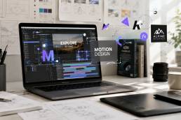
Lower thirds, animated titles, and brand elements need to sit comfortably inside the same color world. This guide on how to create motion graphics is useful if you want those elements to support the grade instead of distracting from it.
Polish should match the format
Creators sometimes over-finish short-form content because they want it to look expensive. Viewers usually respond better when the polish fits the context.
A founder interview benefits from balanced contrast, believable skin, and a clean neutral base. A social clip can carry a little more punch, but it still needs to feel human. A stylized brand film gives you more room to push hue separation, contrast design, and atmosphere because the audience expects a stronger point of view.
This is one reason many teams hand grading off once content volume starts growing. The trade-off is real. You can spend months building taste and technical control, or you can protect production time and get a repeatable finish that strengthens the brand faster. Flexwork sits in that gap. The service is valuable because it helps creators move from inconsistent DIY grades to a polished visual system that supports growth.
If you want a wider view of how automation is changing finishing work, Revolutionizing post-production with AI offers a useful perspective on where AI-assisted grading can speed up the process without replacing creative judgment.
Elevate Your Content Today
Color is one of the fastest ways to communicate whether your brand is still experimenting or already established. A careful grade makes footage feel confident. It gives interviews more authority, social clips more stopping power, and long-form episodes a level of finish that matches the value of what's being said.
That doesn't mean every creator needs to become a full-time colorist. It does mean every serious creator should understand what good finishing looks like, what weak finishing costs them, and where the trade-off sits between learning the craft and protecting their time.
Keep these standards in view
- Separate correction from grading
- Convert LOG footage properly before styling
- Use scopes, not just instinct
- Protect skin tones
- Match every shot before chasing a look
- Grade for the format and audience, not for your ego
For podcasters and business owners, this is bigger than aesthetics. It's part of positioning. Your audience often decides how credible you are before they decide whether they agree with you. If you're refining the broader system around your content, this guide to a video content marketing strategy connects production quality with distribution and brand growth.
Your message can be brilliant and still lose impact if the visual finish feels careless.
The good news is that the path from flat footage to a signature look isn't mysterious. It's a repeatable process. Learn it well, or work with people who already have.
If you're ready to create podcast and video content that looks as polished as your brand deserves, Flexwork Podcast Studios offers the studio environment, production support, editing, motion graphics, and growth-focused services to help you get there faster. Book a session, explore production packages, or schedule a tour in Springfield, NJ to see how a professional setup can change the way your content shows up.