Antique Country Kitchen: 8 Ideas for Your Podcast Set
Meta title: Antique Country Kitchen Set Ideas for Podcasts
Meta description: Build a standout podcast set with antique country kitchen ideas that enhance your brand and work beautifully on video.
URL slug: /antique-country-kitchen-podcast-set-ideas
Primary keyword: antique country kitchen
Secondary keywords: podcast set design, content studio aesthetic, vintage kitchen backdrop
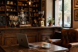
Beyond audio, your set is doing brand work every time the camera turns on. Viewers decide within seconds whether your show feels thoughtful, premium, and memorable, or like another DIY setup with no visual point of view. That's where many ambitious creators get stuck. The microphone may be solid, the conversation may be sharp, but the backdrop looks generic, inconsistent, or flat on camera.
An antique country kitchen solves a specific branding problem. It gives lifestyle, culinary, wellness, and founder-led shows a world, not just a wall. The look signals warmth, craftsmanship, heritage, and personality. It helps your clips feel lived-in instead of staged, which matters when you're trying to build trust and recognizable visual identity across reels, interviews, and branded content.
But building that environment yourself eats time fast. Sourcing vintage pieces, balancing authenticity with practicality, and making the room film well is a real production job. That's why creators use professional studios as a strategic asset. At Flexwork Studios, you can focus on the content while the environment supports the brand. Our Content Day is $3000 and includes either 20 edited reels or 60 professional photos, which makes it a strong fit for creators who want a polished visual library without the usual production drag. If you want to see how the antique country kitchen aesthetic translates into a compelling podcast set, start with these eight ideas.
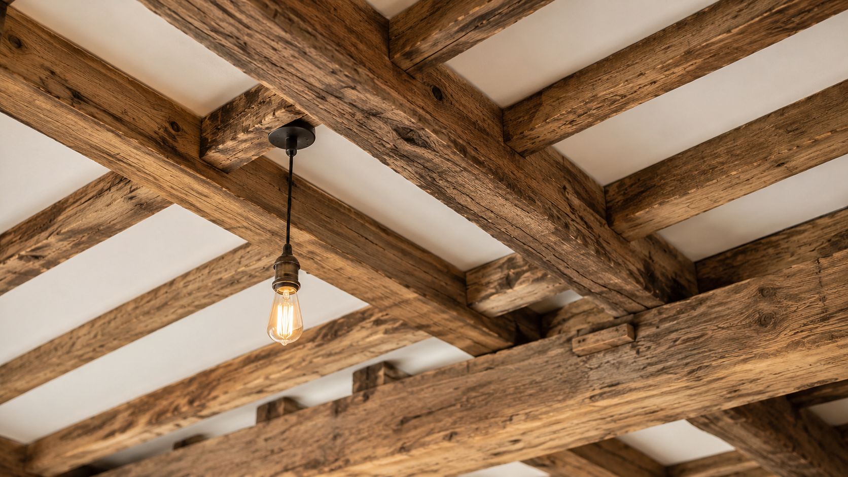
1. Exposed Wooden Beams and Ceiling Details
Your camera is rolling. The conversation is strong, the styling is decent, and the frame still feels forgettable because the ceiling says nothing. Exposed wooden beams fix that fast. They give the set structure, age, and authority before a viewer notices a single prop on the counter.
Antique country kitchen design comes from real working spaces, which is a key detail. The best versions do not feel decorated for the sake of content. They feel built over time. Ceiling beams, plank details, and visible joinery carry that story better than almost any accessory because they shape the room itself.
Make the ceiling work on camera
Creative founders often spend too much on tabletop styling and ignore the upper frame. That choice weakens the whole set. In video, beams create depth, define sightlines, and make medium and wide shots feel finished. They also help your studio look established, which supports a stronger brand identity across interviews, reels, course content, and sponsored campaigns.
Use them with discipline.
- Choose a matte or low-sheen finish: Shiny stain reflects studio lights and makes reclaimed wood look artificial.
- Set camera angles around the beam rhythm: Parallel or gently converging lines read cleanly. Harsh cross-lines above the host look distracting.
- Add separation with side or bounce light: You want grain, texture, and shadow. You do not want a heavy dark ceiling flattening the frame.
- Keep proportions believable: Thick rustic beams suit a larger room. In a compact studio, slimmer ceiling details usually look more refined on camera.
Practical rule: If your wide shot feels flat, improve the ceiling architecture before buying more decor.
This is a strategic design choice, not a rustic cliché. A founder-led show looks more premium when the space has real architectural character. A culinary brand gains warmth. A wellness creator gets a backdrop that feels grounded instead of sterile. For any content business that depends on trust and visual recall, beams help turn a set into a recognizable brand asset.
If you are building this look from scratch, get the construction and lighting right the first time. Salvaged wood, faux beam installation, ceiling reinforcement, and fixture placement all affect how the room performs on camera. Professional set styling and production support usually cost less than correcting a space that looked good in person and disappointing on screen.
2. Vintage Cast Iron and Copper Cookware Display
Nothing says substance like cookware that looks earned. Copper pans, blackened cast iron, and old kettles give your background visual weight without making it feel busy.
This works especially well for creators whose brand touches hospitality, nourishment, ritual, homemaking, entrepreneurship, or legacy. You don't need to be a cooking show. You need objects that suggest use, care, and continuity.

Curate, don't clutter
A strong cookware wall isn't a flea market explosion. It's edited.
Group pieces by finish and silhouette. A row of copper with one dark cast iron skillet can look refined. A random pile of mixed metals usually looks accidental. For a conversational set, hang larger pieces off to one side of the frame and leave negative space near the speaker.
Try this structure:
- Anchor with one hero piece: A large copper pot or deep skillet should carry the composition.
- Build a secondary cluster: Add two or three smaller items nearby to create rhythm.
- Avoid shiny overload: Patina reads better than mirror-polished metal in most studio lighting.
The best props in a podcast set look like they belong to the host, even when the set is professionally styled.
There's also a content advantage here. Distinctive cookware becomes recurring visual language. Audiences start recognizing your clips by the environment before they read the caption. That's strong branding.
For creators planning a high-output batch day, this kind of backdrop pays off most when it's captured well. Flexwork's Content Day package is built for exactly that. You can produce a bank of short-form clips and still photography against a set with more story and texture than a plain rental wall ever gives you.
3. Apothecary Jars and Vintage Glass Storage
Glass is where an antique country kitchen starts looking layered instead of obvious. Apothecary jars, old preserving jars, and vintage bottles bring in reflection, transparency, and repetition, which all read beautifully on camera when the styling stays controlled.
For wellness creators, herbalists, chefs, nutrition voices, and lifestyle founders, this detail also reinforces subject matter. Dried citrus, tea blends, grains, wooden utensils, recipe cards, and labeled pantry goods all create useful visual shorthand.

Use glass to create depth
The key is staggered placement. Put some jars close to the wall, some near the shelf edge, and keep heights varied. When the camera sees layers, the background feels dimensional instead of flat.
Labeling matters too. Skip novelty labels. Use restrained paper tags or understated hand-lettered cards that fit the period feel. If the words are too modern or too cutesy, the illusion breaks.
A few strong fills work better than many weak ones:
- Dried herbs and tea leaves: Soft color, organic shape, good for close-up details.
- Flour, oats, or rice: Neutral texture that supports an earthy palette.
- Wooden spoons or scoops: Useful for breaking up too much glass.
This is also where practicality matters. Style coverage often stops at the visual checklist, but creators need a set that performs. One of the biggest gaps in antique country kitchen guidance is how to preserve historic character while integrating modern functionality like better lighting, efficient systems, and real usability, as noted in this piece on creating a country kitchen that balances period charm with daily life. That principle applies directly to a content studio. Your jars should look authentic and still be easy to reset between shoots.
4. Shiplap and Wainscoting Wall Treatments
Walls do more branding work than most creators realize. If your background wall is blank drywall, your set has to work harder. Shiplap or wainscoting gives the camera structure right away.
This is one of the simplest ways to create an antique country kitchen mood without overcommitting to props. Painted boards, paneled lower walls, and modest trim all suggest permanence. They also let your furniture and styling feel grounded.
Pick a finish that flatters skin tone
Bright white can look harsh on camera. Soft cream, warm stone, muted mushroom, or gentle gray often performs better, especially when your show uses natural wood and brass.
If you want a wall treatment that supports both vintage styling and modern relevance, keep the finish slightly imperfect but not distressed to the point of parody. The room should feel refined, not themed.
A practical setup looks like this:
- Choose vertical or horizontal rhythm carefully: Horizontal boards feel classic farmhouse. Paneled wainscoting feels more refined.
- Use restrained trim: Too much millwork can compete with the people on camera.
- Reserve one cleaner wall zone: This gives you flexibility for tighter guest shots or branded overlays.
If you're building out visual references, these inspiring farmhouse backsplashes can help you think about texture, tone, and how rustic elements stay refined.
For podcasters, this backdrop style is especially useful because it doesn't date your content quickly. A wall with character can support solo episodes, guest interviews, sponsor reads, and promotional photography without needing a complete reset every time.
5. Antique Farmhouse Sink and Vintage Faucets
Your camera is rolling. The counter is styled, the shelves look good, and the shot still feels generic. A proper farmhouse sink fixes that fast. It gives the frame weight, history, and a clear point of view.
Choose a deep apron-front sink and pair it with a bridge or gooseneck faucet in unlacquered brass, aged nickel, or weathered bronze. That combination reads clearly on camera and gives your set a signature feature people remember. For creators building a studio that has to work across reels, interviews, product shots, and brand photography, that kind of visual anchor matters.
Place the sink where it can show up in a three-quarter angle rather than only straight on. The goal is not decoration alone. The goal is a backdrop with structure. A visible sink zone creates natural opportunities for movement, hand shots, prop styling, and tighter framing that still feels intentional.
Keep the surrounding styling disciplined. Add a folded linen towel, a handmade soap bottle, a small crock of wooden utensils, or one worn cutting board. Stop there. Too many accessories cheapen the shot and pull attention away from the fixture that should carry the scene.
For a useful reference on balancing rustic character with restraint, see All Well Property Services' decor guide.
If you plan to use this backdrop as a business asset, treat installation quality as part of the brand. Crooked faucet lines, poor sink placement, and awkward splashback proportions show up immediately on camera. Get the fixtures right, and the whole studio looks more established.
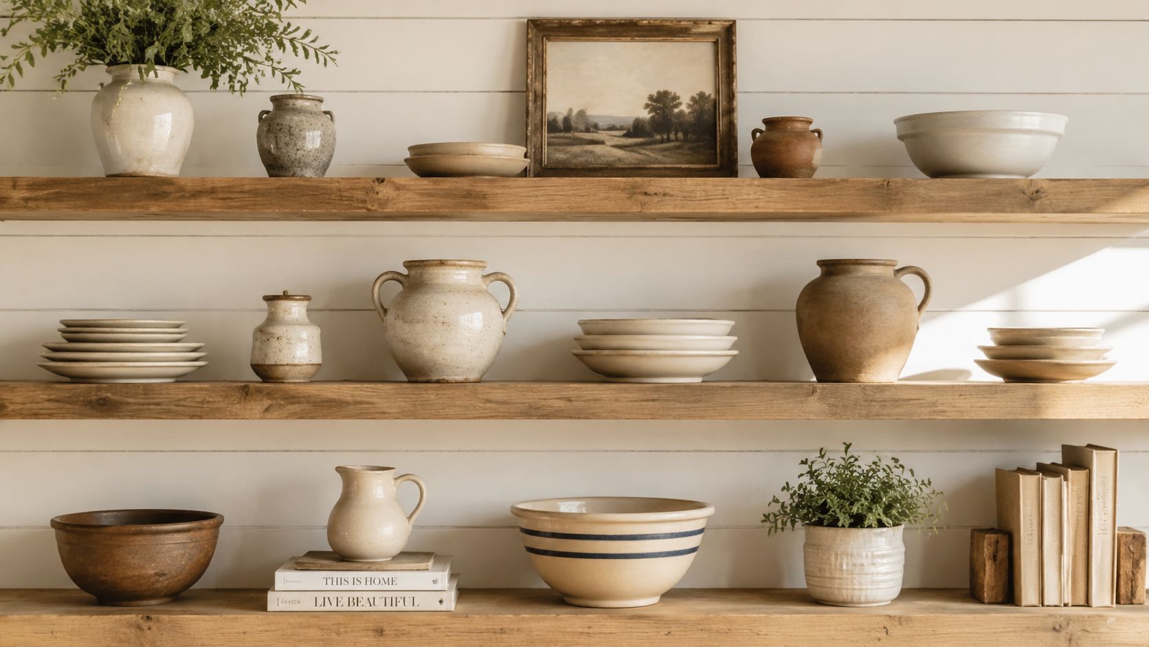
6. Vintage Open Shelving with Curated Collections
Open shelving is where your brand gets personal. Cabinets hide. Shelves reveal.
That's why they work so well for an antique country kitchen set. You can display ironstone, stacked bowls, cookbooks, pottery, crocks, baskets, spice tins, or branded objects that connect directly to your voice. The shelf becomes a visual bio.
Style shelves like a brand system
Most creators either under-style shelves or overfill them. The right answer sits in the middle. You want enough variation to feel collected, but enough restraint to feel expensive.
A reliable formula:
- Use repetition: Repeated whites, creams, woods, or one metal finish make the shelf look intentional.
- Vary heights: Stack plates, stand a cutting board, add a tall bottle, then bring in a low ceramic piece.
- Leave breathing room: Empty space is part of the styling.
If your podcast touches business, wellness, design, food, or family life, use objects that support those themes. A handmade mug, a worn recipe binder, or old kitchen scales can say more than generic decorative signs ever will.
This approach also aligns with where real renovation demand sits. The broader kitchen market remains substantial, with the global kitchen cabinets market valued at USD 107.86 billion in 2025 and projected to reach USD 218.23 billion by 2034 at an 8.26% CAGR in Fortune Business Insights' kitchen cabinets market outlook. For creators, the takeaway is simple. Cabinetry and storage still carry serious value. A set built around substantial storage elements looks more premium than one built from surface decor alone.
For extra inspiration on balancing warmth and edit, this farmhouse decor guide is a useful visual reference.
7. Vintage Textiles, Linens, Quilts, and Woven Pieces
Hard surfaces alone can make a kitchen set feel severe. Textiles solve that fast.
A folded quilt on a bench, a striped linen draped near a table, or a woven runner under ceramic pieces adds softness that cameras love. It also helps your set feel inhabited, which is exactly what many founder-led and lifestyle brands need. The goal isn't perfection. It's atmosphere.
Add softness without losing polish
Keep the palette narrow. Oatmeal, faded red, muted blue, warm cream, soft green, and weathered brown all work well. The moment the textiles become too bright or too trend-driven, the antique effect disappears.
Use them in ways that feel plausible inside a working kitchen. Hang a tea towel from a peg. Fold linens on a shelf. Lay a simple runner under a bowl arrangement. Don't drape fabric everywhere.
Soft goods are often the difference between a set that looks assembled and one that looks inhabited.
There's also a practical branding angle. Textiles help create close-up moments for reels, intros, and cutaways. A hand smoothing linen across a wooden table or a folded quilt near a stool gives your editor richer visual material than talking-head footage alone.
Market context supports this more functional approach to styling. In the U.S. kitchen furniture market, residential demand held 79.30% share in 2025, and the premium tier is projected to expand at 4.82% annually through 2031 in Mordor Intelligence's U.S. kitchen furniture market report. The implication for a content set is clear. Buyers and homeowners keep valuing durable, lived-in kitchen environments. Your backdrop should feel useful and enduring, not decorative for decoration's sake.
If you want tactile accents that still feel refined, this look at textured throw styling and lasting comfort can help you think about layering.
8. Vintage Signage, Typography, and Inspirational Words
Most signage in podcast sets is too obvious. It either screams branding or looks like filler bought in a rush.
Vintage signage works when it feels native to the room. Old pantry labels, enamel-style plaques, hand-painted boards, or small typographic pieces can reinforce your show identity without turning the set into an ad.
Keep the message subtle
Use words sparingly. One sign with authority beats three signs competing for attention. If you commission a custom piece, make it feel period-appropriate in both language and finish.
For example, a culinary creator might use an old-style provisions sign. A wellness show might place a modest herb or apothecary label near shelving. A founder podcast could use a family name, a studio mark, or a location-based sign that feels rooted rather than promotional.
This is also where authenticity matters. One major collectible category in historic kitchens is steel cabinetry. Vintage cabinet research identifies Murphy Cabranettes by the Murphy Door Bed Company in 1926 as the earliest verified date cited for a steel kitchen cabinet, and notes that renovators still seek names like GE, Republic, American, Crosley, Beauty Queen, and Morton in this history of metal kitchen cabinets. That kind of specificity is useful because it reminds you what real period character looks like. It's usually found in substantial fixtures and branded artifacts, not generic faux-rustic slogans.
When signage supports a room like that, it feels smart. When it tries too hard, it weakens the whole set.
A good sign should do one of two things. It should deepen the story of the room, or subtly strengthen your own brand language. If it doesn't do either, remove it.
Antique Country Kitchen, 8-Item Comparison
| Element | Implementation complexity | Resource requirements | Expected outcomes | Ideal use cases | Key advantages |
|---|---|---|---|---|---|
| Exposed Wooden Beams and Ceiling Details | High, structural work and pro installation | High cost, reclaimed timber, lighting and maintenance | Strong rustic focal point, improved natural acoustics, warm video backdrop | Branded podcast/video studios seeking authentic farmhouse look | Distinctive visual character, natural sound diffusion, durability |
| Vintage Cast Iron and Copper Cookware Display | Medium, secure mounting and curation | Moderate cost, sturdy mounts, periodic maintenance to prevent corrosion | Heritage-rich, textured background with reflective highlights on camera | Culinary, history or lifestyle podcasts featuring cooking or provenance stories | Storytelling props, affordable sourcing, engaging visual texture |
| Apothecary Jars and Vintage Glass Storage | Low–Medium, styling, labeling and lighting control | Low cost, varied jars, regular cleaning and organization | Layered visual depth, backlighting opportunities, ingredient showcase | Multi-camera shoots, food/ingredient-focused episodes, craft content | Versatile, easy to refresh, enhances lighting effects |
| Shiplap and Wainscoting Wall Treatments | Medium–High, precise installation and finishing | Moderate cost, professional install recommended, paint/sealants | Consistent branded backdrop, improved sound absorption and diffusion | Studios needing repeatable, professional-looking video backgrounds | Recognizable country aesthetic, acoustic benefits, versatile |
| Antique Farmhouse Sink and Vintage Faucets | High, plumbing, structural support and specialist install | High cost (fixtures + installation), ongoing specialized maintenance | Powerful visual anchor, enables live demonstrations, increases authenticity | Culinary demos, lifestyle episodes that require on-camera sink use | Functional focal point, compelling storytelling element |
| Vintage Open Shelving with Curated Collections | Medium, mounting and continual styling | Moderate cost, curated items, frequent dusting and rotation | Dynamic, interchangeable backdrop that invites viewer curiosity | Lifestyle and food podcasts, interactive or seasonal content | Flexible displays, easy updates, encourages audience engagement |
| Vintage Textiles: Linens, Quilts, Woven Pieces | Low–Medium, careful display and preservation | Low–moderate cost, proper storage, occasional professional cleaning | Adds warmth, softens hard elements, supports close-up storytelling | Heritage craft episodes, cozy brand imagery, textile-focused content | Introduces color/pattern without clutter, swapable props |
| Vintage Signage, Typography, Inspirational Words | Low, selection and strategic placement | Low cost, DIY or commissioned options, readability checks | Reinforces brand identity, creates focal points, guides viewer attention | Branded shows, thematic episodes, seasonal messaging | Affordable brand reinforcement, instant nostalgia, easy to update |
From Inspiration to Professional Production
An antique country kitchen can do far more than make your podcast look nice. It can sharpen your positioning. It can make your clips more recognizable. It can help your audience feel your brand before they fully process your words.
That's why this aesthetic works so well for creators building a visual-first business. It communicates warmth, heritage, care, and taste. Those are strong signals for coaches, culinary voices, lifestyle founders, wellness brands, and personality-led shows that want to feel premium without looking cold or corporate.
But the gap between inspiration and execution is where most creators lose momentum. Sourcing old materials, styling shelves, balancing texture on camera, managing lighting, and recording clean audio in the same environment takes real production judgment. It's easy to burn days chasing references and still end up with a set that doesn't shoot well.
That's where professional support changes the equation. Flexwork Studios gives you the infrastructure to create polished content without carrying every technical and creative detail alone. If you want to batch a high-end visual library quickly, the Content Day package at $3000 is a strong option, especially if you need either 20 edited reels or 60 professional photos from a single production day. If you're building a show with more serious growth goals, podcast websites are $5000 plus hosting, which helps align your set, your show identity, and your discoverability under one brand system.
For creators who are ready for a full-service approach, the Market, Manage & Produce My Podcast package starts at $1500 per episode and includes a 20-episode growth commitment. That's the right move when you want more than a pretty backdrop. It's for creators who want production, consistency, distribution support, and a business-minded path to audience growth.
The bigger point is simple. Your set isn't background. It's an asset. It shapes how your brand is perceived across YouTube, reels, guest clips, trailers, and still photography. When that environment is distinctive and professionally executed, every piece of content works harder.
If the antique country kitchen look fits your voice, don't treat it like a side project. Build it into your content strategy. Then produce it at the level your brand deserves.
If you're ready to turn your show into a polished visual brand, book a tour with Flexwork Podcast Studios. You'll get a premium production environment in Springfield, NJ, plus the option to scale with studio rentals, Content Days, producer support, and growth-focused podcast services that help your content look sharper and go further.