
Choose Your Video Production Company Website Template For
Meta title: Choose Your Video Production Company Template
Meta description: Choose a video production company website template that books clients, supports SEO, and turns your portfolio into a conversion engine.
URL slug: /video-production-company-website-template
Primary keyword: video production company website template
Secondary keywords: videographer website template, production company website design, podcast website
Your work looks expensive. Your website probably doesn't.
That mismatch costs more than pride. It costs inquiry quality, referral confidence, and the kind of clients who decide whether you're a creative with talent or a business with systems. A lot of studios sit on strong footage, polished edits, and real capability, then send people to a site that feels like an old business card with a Vimeo embed.
A strong video production company website template fixes that only if you treat it like infrastructure, not decor. The goal isn't to make your homepage feel cinematic for ten seconds. The goal is to help the right buyer understand what you do, trust that you can do it well, and contact you without friction. If you're building that kind of site, this guide will sharpen the decisions that matter. For a broader growth lens, this breakdown of video content marketing strategy is a useful companion.
Introduction
A prospect hears about your studio, clicks through, and decides what kind of company you are in under a minute. If the site feels vague, hard to scan, or built to show work instead of sell a service, strong creative alone will not carry the inquiry.
For a video business, the website is not just a portfolio. It is the sales surface that qualifies leads, frames your offer, and gives buyers enough confidence to start a conversation.
Studios lose good opportunities here all the time. The reel is strong, the service mix is real, and the team can deliver, but the site makes visitors guess. What do you produce. Who is it for. How do I hire you. High-value clients rarely work that hard.
Video also supports discovery when the site is structured well. Wyzowl reports in its research on video marketing statistics that marketers continue to use video because it helps with engagement, understanding, and conversion. That matters for a production company website design because the job is bigger than showcasing taste. The site needs to attract the right search traffic, present proof in context, and move serious buyers toward contact.
If you run a production company, manage a content studio, or offer a podcast website as part of your services, the right video production company website template gives you a head start only when it supports that business goal. A polished layout helps. Clear positioning, service pages, proof, and a direct inquiry path book the work. For a broader view of how your site should support growth, this guide to video content marketing strategy is a useful companion.
Why Your Good Enough Website Is Costing You Clients
A weak site rarely fails in a dramatic way. It leaks value in small moments.
A prospect lands on the homepage and can't tell whether you shoot branded campaigns, podcasts, or social clips. They click the menu and hit vague labels like “Work” or “Projects” instead of clear service pages. They want to reach out, but the contact process feels slow, generic, or oddly intimidating. None of that feels catastrophic, yet each step increases drop-off.
That's why most template advice misses the point. As noted in Elfsight's discussion of video production website templates, the underserved angle isn't visual styling. It's conversion strategy for studio-based sites, especially the pages, calls to action, and booking flows that help commercial clients, creators, and agency buyers move forward.
What a buyer is actually looking for
When someone hires a production company, they're buying judgment as much as craft.
They want to know:
- Can you solve my specific need. Podcast production, branded video, editing support, launch assets, or recurring content.
- Have you done this before. A reel alone doesn't answer that unless it's paired with context.
- Are you organized enough to trust. Clean pages, clear offers, and a direct inquiry path signal operational maturity.
- Will contacting you be easy. If your form feels clunky, buyers assume the project process will too.
A pretty website can still be confusing. Confusing websites don't book premium work.
The architecture that changes the result
High-performing studio sites tend to follow a cleaner conversion path. They lead with proof, move quickly into services, and present a direct next step before attention fades.
The practical structure usually looks like this:
- Hero section with one clear promise and a short visual sample.
- Trust indicators such as testimonials, logos, recognizable clients, or production context.
- Service pages that explain what's included, who it's for, and what outcomes matter.
- Location signals so regional buyers know you're relevant to their market.
- Contact capture that asks for enough detail to qualify the lead, but not so much that people abandon it.
A portfolio-only template can show talent. A conversion-focused template helps talent turn into booked work.
Where most creators get it wrong
The biggest mistakes are rarely technical.
- They choose mood over clarity. The site feels stylish, but nobody can tell what to buy.
- They stack too much video on the homepage. Heavy motion can distract from the offer and make navigation feel secondary.
- They skip dedicated service pages. Buyers end up guessing whether you handle strategy, shooting, editing, publishing, or all of the above.
- They hide contact behind a vague funnel. “Let's connect” sounds softer than “Book a studio tour” or “Request production pricing,” but it usually converts worse.
If your site makes visitors work to understand you, they won't reward the effort. They'll leave and contact the company that made the decision easier.
The Blueprint for a High-Converting Studio Website
The right template should support a buyer journey, not just a visual style. Curious Refuge recommends a conversion path built around a homepage hero, trust indicators, a demo reel, service pages, location signals, and a contact form in its guide to a video production company website. That structure works because it puts proof, offer, and action within easy reach.
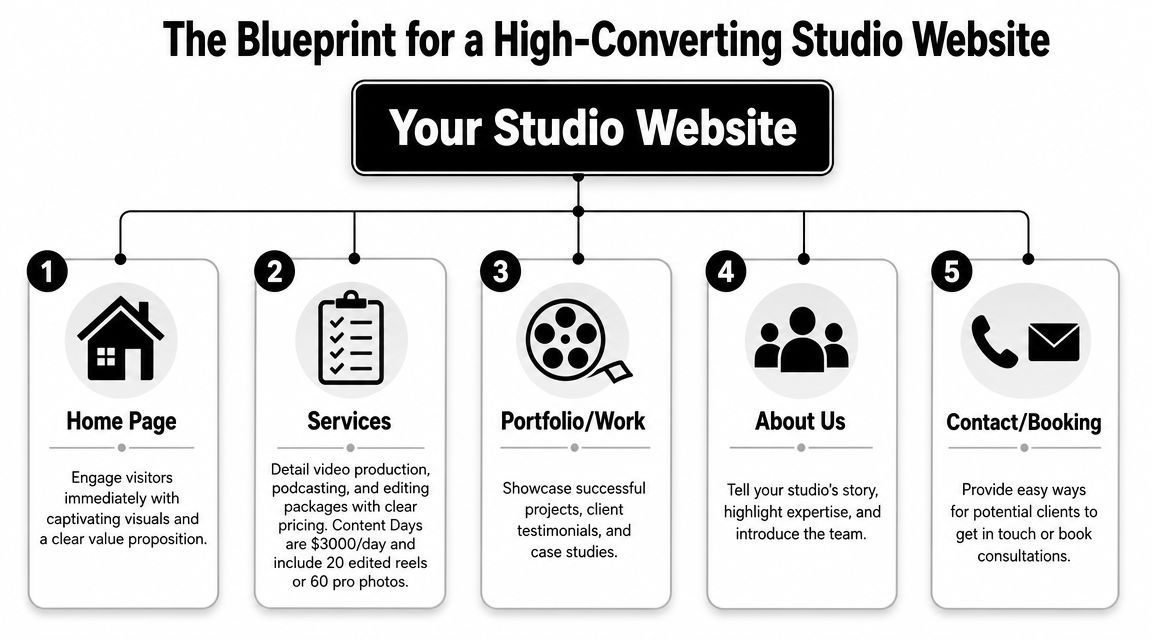
The five pages that do the heavy lifting
You don't need a giant site. You need a site with the right pages.
| Page | What it must do | Common mistake |
|---|---|---|
| Home | Establish positioning fast with a reel, value proposition, and CTA | Opening with abstract brand language |
| Services | Explain your offers clearly by category | Combining everything into one vague page |
| Portfolio or Work | Show range with context, not just visuals | Posting clips with no explanation |
| About | Build trust through process, team, and point of view | Making it a biography instead of a credibility page |
| Contact or Booking | Turn interest into action with a short, useful form | Asking for too much too soon |
A homepage should answer three questions immediately: what you do, who it's for, and what the visitor should do next. If the first screen doesn't handle that, the template is fighting the business.
The assets that belong above the fold
Above the fold is still valuable because it frames the entire visit. For a studio, that space should do more than look sleek.
Use this order:
- A short headline that names the core offer
- A supporting line that adds specificity
- One primary CTA tied to inquiry or booking
- A reel or visual sample that proves quality fast
- A trust layer right below, such as logos, testimonials, or client categories
If you want a useful external read on tightening that path, Otter A/B has a strong piece on unlocking growth with conversions. It's a helpful reminder that design decisions matter most when they reduce hesitation.
Practical rule: If a visitor has to scroll, click, and guess before they understand your offer, your homepage is underperforming.
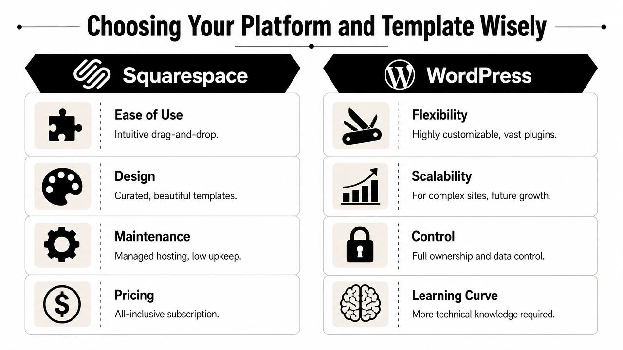
Platform fit matters more than people admit
The same site structure can perform very differently depending on the platform underneath it.
Webflow suits studios that care about layout control, animation discipline, and scalable design systems. It's strong when you want modular service pages and visual precision without hacking a theme.
Squarespace is cleaner for teams that want simplicity and lower maintenance. It can work well for lean studios with a focused offer and fewer custom content needs.
WordPress offers the broadest ecosystem. It's useful when you need deep extensibility, blog depth, or custom functionality, but it also creates more opportunities to overbuild the site.
For studios producing a lot of polished visual assets, editing quality still shapes website quality. If your workflow is still rough around the edges, this guide to best video editing software can help tighten the source material before it ever hits the homepage.
Choosing Your Platform and Template Wisely
There's no shortage of options. ThemeForest lists 1,204 production company website templates in its current production company template marketplace, which tells you two things. First, this category is mature. Second, choosing a template by homepage style alone is a fast way to blend in.
How to decide between platforms
Each platform creates a different kind of workload.
Squarespace works when you want a cleaner setup process, predictable maintenance, and a polished starting point. It's often enough for a studio with a concise service menu and a manageable amount of content.
WordPress is the stronger choice if you expect more customization, broader plugin support, or content-heavy expansion over time. It also asks for more oversight, because flexibility cuts both ways.
Webflow makes sense when visual systems matter, when you want reusable sections, and when you need custom layouts without relying on a patchwork of plugins. It's a strong fit for brand-conscious studios that care about presentation details.
What to inspect before you buy a template
Don't evaluate a template like a spectator. Evaluate it like an operator.
Look for:
- Service page flexibility so you can separate podcast production, editing, content packages, and studio rentals
- Video presentation options that don't force every page into the same gallery style
- Responsive behavior that keeps reels, forms, and CTAs usable on mobile
- Modular sections you can reuse for landing pages, case studies, or campaign-specific offers
- Content management sanity so updating work samples doesn't feel like a redesign every month
A stylish homepage demo can hide a rigid inner-page system. That's usually where the regret starts.
The template isn't the strategy
A lot of creators buy the shell before they've produced the assets that will make it persuasive. That's backwards. Good templates amplify good material. They can't rescue weak footage, mismatched branding, or thin service copy.
That's why platform choice and content creation belong in the same conversation. If you need fresh short-form assets, updated photos, and stronger site visuals, this roundup of best tools for content creators is a practical place to tighten your production workflow before launch.
Buyers don't hire the template. They hire the clarity, proof, and confidence the template helps deliver.
Beyond the Template Your Content and Customization Strategy
A studio owner launches a new site, swaps in a logo, uploads a reel, and waits for inquiries that never quite improve. Traffic might look fine. The problem is conversion. The template gave the business a polished frame, but the content still does not answer the questions high-value clients ask before they book.
That is the actual job of customization. A video production company website template should help qualify leads, support pricing confidence, and make your process feel dependable before the first call. If every page looks good but says little, you attract shoppers instead of decision-makers.
Customize the parts that change how buyers judge you
Start with the elements that shape trust fast.
- Typography: Pick fonts that read cleanly on mobile and feel appropriate for your market. A brand serving law firms and healthcare clients needs a different tone than one selling music videos.
- Color system: Limit the palette and use it with discipline. Consistency reads as control.
- Page structure: Build repeatable layouts for services, case studies, and contact paths so the site feels intentional across every page.
- Image treatment: Thumbnails, stills, team photos, and cover frames should follow one visual standard. Mixed styles make the business feel pieced together.
Then improve the content inside those blocks. A reel gets attention, but buyers often convert on the page that explains the service, shows relevant proof, and removes uncertainty about scope, timeline, or fit.
Content that sells the service, not just the style
Studios often overload the homepage and underwrite the money pages. That is backwards.
A stronger setup usually includes a concise homepage reel, a sharp positioning statement, service pages with example deliverables, and case studies that explain the business problem behind the work. Behind-the-scenes photos or process clips also help. They show organization, crew capability, and production standards, which matter to clients spending real budgets.
Small details matter too. Clean captions, labeled visuals, and accessible media handling make the site easier to use and easier to trust. WebAbility.io offers practical alternative text guidelines that are worth applying while you upload stills, thumbnails, and team images.
One more point from experience. Generic portfolio captions like "Brand video for client" waste valuable space. Use that space to name the deliverable, audience, production challenge, or result. The right client is looking for evidence that you can solve their specific brief.
Strong creative gets attention. Clear positioning and proof get the inquiry.
Know where to spend your effort
Customizing everything is a poor use of time. Customizing the right things pays off.
Write the homepage headline yourself. Rewrite every service page. Replace stock copy in testimonials, FAQ blocks, and contact prompts. Keep template animations, spacing systems, and utility pages if they work. Buyers do not care whether you designed the accordion style from scratch. They care whether the site makes hiring you feel low-risk and worth the budget.
If motion is part of your brand presentation, plan it deliberately. This guide on how to create motion graphics is useful if you want intros, transitions, or supporting visuals that strengthen the site without slowing it down.
When DIY starts costing more than it saves
There is a point where self-building turns into delay. It usually happens after too many late-night edits, half-finished copy, and a site full of placeholders that never become convincing sales assets.
For creators who need both structure and media, Podcast Websites can be built as a done-for-you service at $5000 plus hosting, and Content Days are $3000/day and include 20 edited reels or 60 pro photos. That pairing solves a common problem. The site needs better messaging, and the business also needs stronger proof to put on the page.
A good template gets you started. Revenue usually comes from what you say, what you show, and how clearly the site guides the right client to contact you.
The Pro Solution Build Your Website with Flexwork
Some studio owners should absolutely start with a template and customize carefully. Others are already past that phase. If the business is active, the offers are defined, and the next goal is better lead quality, a custom build often makes more sense than endlessly adapting a generic layout.
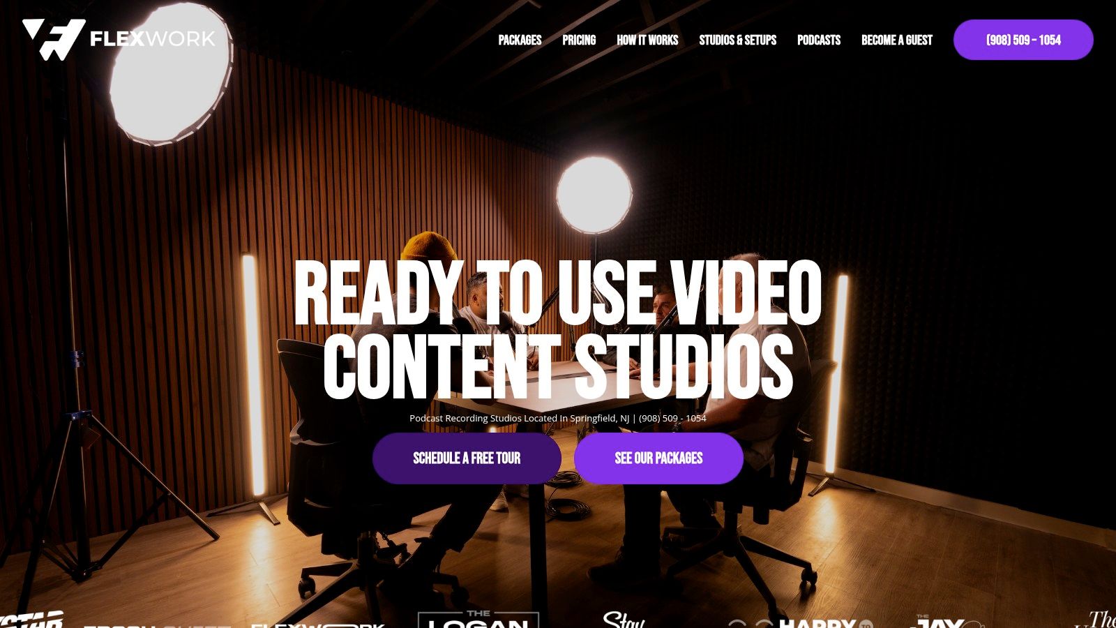
A practical route is pairing website production with asset creation so the site launches with real substance. Podcast Websites are priced at $5000 plus hosting, and Content Days are $3000/day and include 20 edited reels or 60 pro photos. If you already know your current site undersells the brand, that pairing is efficient because the copy, visuals, and offer structure can be built together instead of in separate phases.
A cleaner launch sequence
The launch process works better when the decisions happen in order.
- Define the core offer. Decide what the site is really selling first. Studio rentals, production packages, editing, or recurring content support.
- Map the pages. Home, services, work, about, and contact are usually enough to start.
- Gather proof assets. Reels, photos, testimonials, process visuals, and examples by service line.
- Write for buyers. Lead with what the client gets, not with your favorite creative language.
- Connect the CTA. Booking, inquiry, or consultation should be obvious on every key page.
What to check before launch
A polished build still needs operational sanity.
- Forms should qualify, not interrogate. Ask for contact details, service type, and project context. Skip the essay prompt.
- Navigation should reflect buying intent. “Services” beats “What We Do.” “Book” beats “Connect.”
- Mobile should feel finished. Many creative sites look strong on desktop demos and awkward everywhere else.
- Media should support the sale. Every reel, gallery, or case study should answer a buyer question.
For teams that want to understand the production process before committing, the how it works page gives a useful view into how this kind of build can be structured.
Your Pre-Launch SEO and Go-Live Checklist
Before you publish, tighten the site for search and usability. Current template guides often skip the practical details that help service businesses get discovered. As noted in Envato Elements coverage of video production web templates, many guides rarely explain how to use FAQ sections, structured service pages, clip galleries, schema, and transcript-led landing pages for AI Overviews, which now reach more than a billion users.
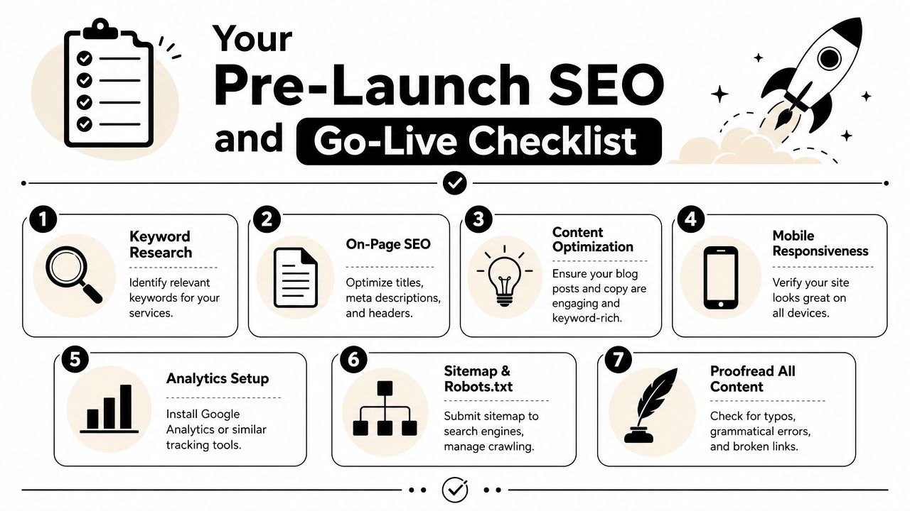
Use this final pass before you go live:
- Write clear page titles: Every service page should say what it is, who it's for, and where relevant, where you work.
- Refine meta descriptions: Keep them readable and specific. Treat them like ad copy, not keyword stuffing.
- Name media files intentionally: Descriptive names help keep your asset library organized and support search clarity.
- Add FAQs where buyers hesitate: Answer turnaround questions, deliverables, studio details, and production process concerns.
- Create structured service pages: Don't rely on one generic services page if you offer distinct packages.
- Review transcripts and captions: If you publish clips or embedded videos, text context helps both users and discovery.
- Check forms and links manually: Broken buttons waste the traffic you've worked to earn.
This video is also worth reviewing before launch:
For a broader final QA pass, Keyword Kick's site launch checklist is a practical companion.
If your website still feels like a placeholder, it's time to treat it like part of the production business. Flexwork Podcast Studios supports creators with studio rentals, production services, Content Days, podcast websites, and growth-focused support for teams that want a sharper digital presence and a smoother path to booking.